If you want your SaaS landing page to convert, it’s best to create a product design that delivers exactly what the user expects to see. It should be easy to use, engage the user, and be transparent.
For example, the landing page should explain who the product is for, and the product’s uses and value for your website visitors to understand its benefits and take action
SaaS landing page examples you need to avoid are designs that have little negative space, too much content, poorly placed CTA, and hard-to-find action elements that are needed to motivate users to subscribe.
But first, what should a SaaS design be made of and how can it help with conversion rates?
In this article
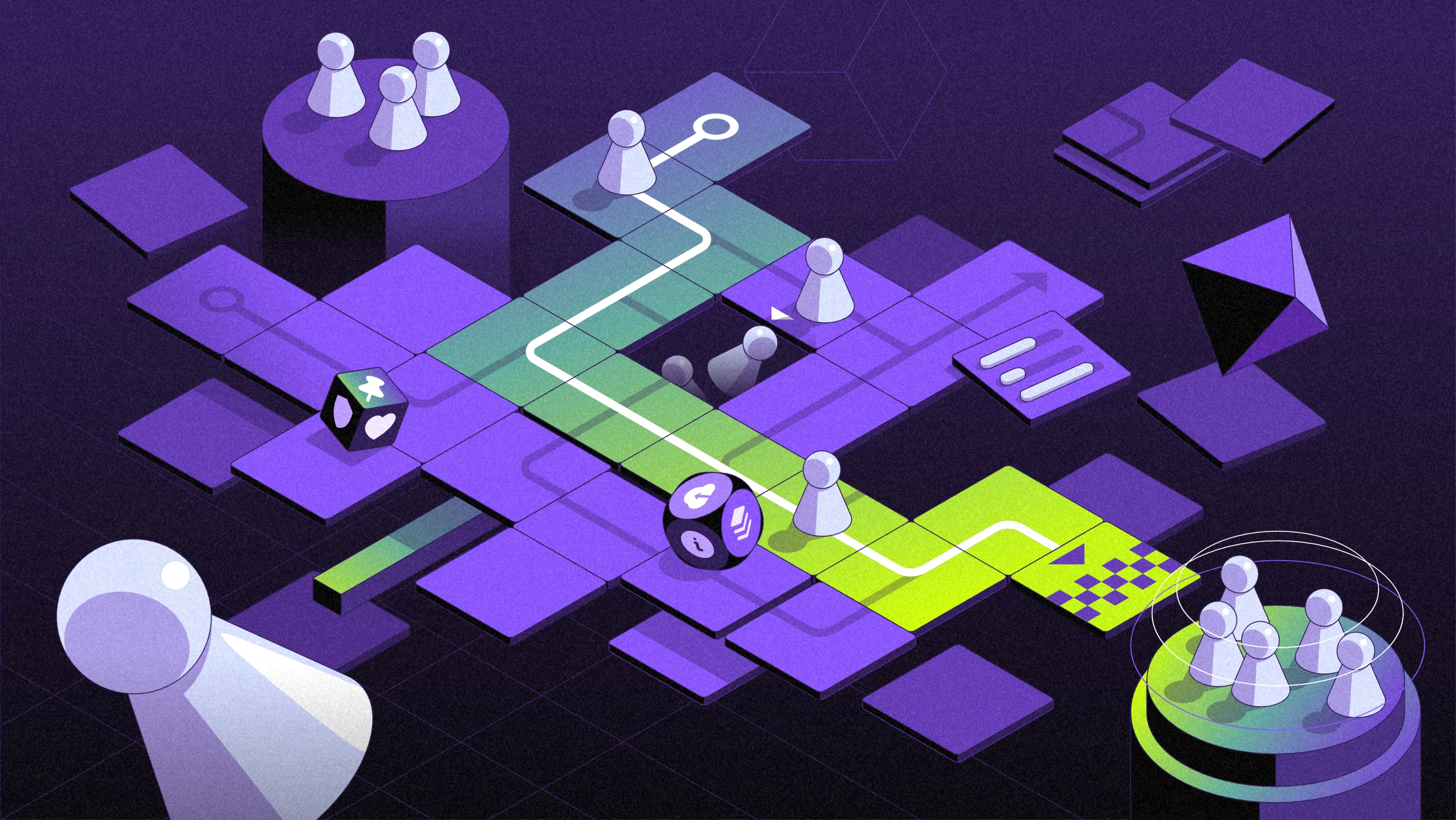
What is a SaaS Landing Page?
A SaaS landing page is the main page of a website, its homepage, which helps sell or promote a software product. It's usually the first thing a potential customer sees and therefore is the most important space for making a good impression.
This page should explain what the software does and why it's useful. The goal is to get visitors to sign up, buy your product, or try a demo. Understanding who the visitors are and what they want is key to making a good landing page.
8 SaaS landing page examples and why they convert
01. Ellie.ai
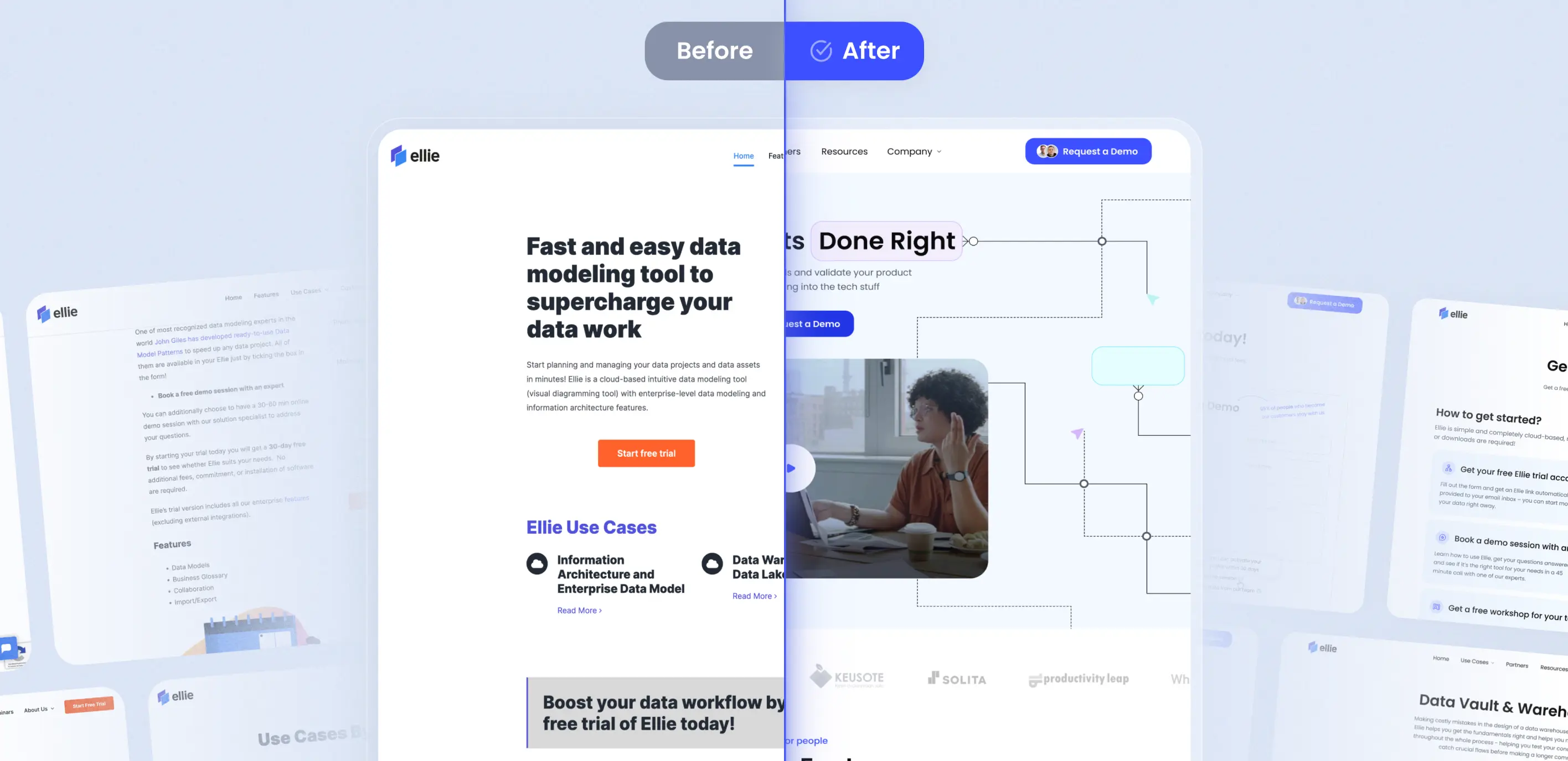
First in our list of top SaaS landing page examples is Ellie.ai, a SaaS startup company that offers cloud-based visual diagramming software for data teams.
The company’s goal is to help users from any background and industry map out their data workflow more efficiently than ever before and it is successfully achieving its mission while growing its clientele with over 6000 users and 40 enterprise customers.
Why it works
- Encouraging CTA: This SaaS landing page example offers a free trial, demo sessions, and workshops, which mitigates consumer nervousness and allows users to experience the product firsthand while the company gathers valuable feedback.
- Use Cases: The landing page clearly describes and visualizes the product’s use cases so that visitors know how the product’s features can be applied in their business.
- Interactive and Informative Design: Ellie.ai's landing page avoids linear formats in favor of an interactive approach, enhancing user engagement and memory retention. The clever use of Hick’s Law in the UX design ensures that essential information is readily available, reducing decision-making time. You can learn more about SaaS UX techniques in our guide.
- Engaging Video: The user is immediately drawn toward a short video that communicates the software’s solutions to the user’s problems.
02. Maze
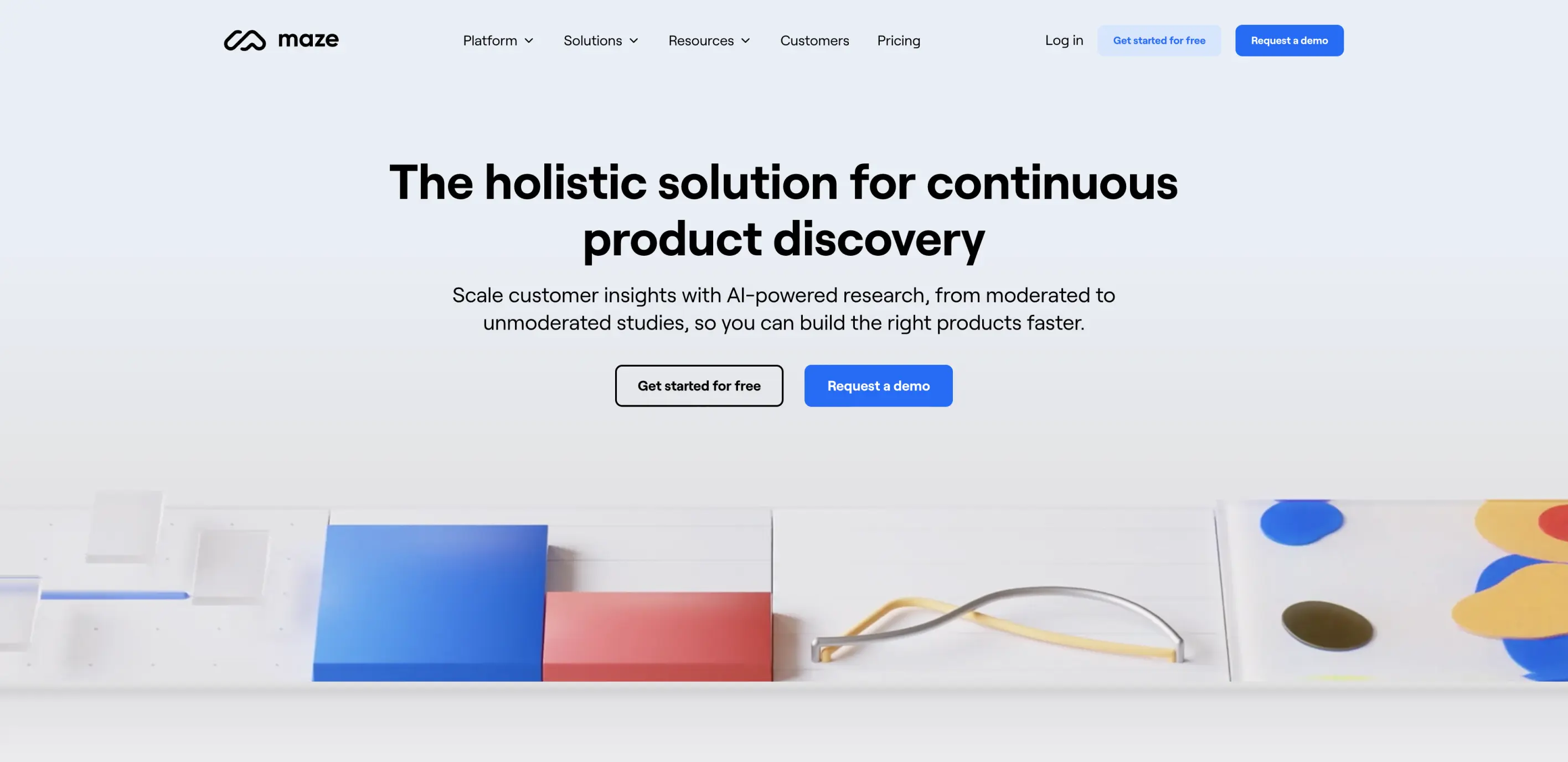
Next in our list of SaaS landing page examples is Maze, an AI-powered user testing platform used by teams at recognizable companies like Uber, McKinsey & Company, National Geographic Society, and Walmart. It turns real user insights into actionable data that improves website and app designs based on Adobe XD, Figma, Sketch, InVision, or Marvel.
Maze helps designers and developers make informed decisions, run usability tests, and ensure a user-centric approach to product development.
Why it works
- Creative Animations: Unlike typical SaaS landing pages that rely on product demos, Maze breaks the mold by incorporating captivating pinball-style animations across their page, adding a unique and visually engaging aspect.
- Dual CTAs: Maze innovatively positions two call-to-action buttons side by side, unlike the common single-button approach. This is enhanced by a smart use of contrasting colors, subtly indicating the primary and secondary nature of the CTAs.
- Proof of ROI: This SaaS landing page example effectively uses an inviting CTA that builds user trust with bold statistics.
03. Popupsmart
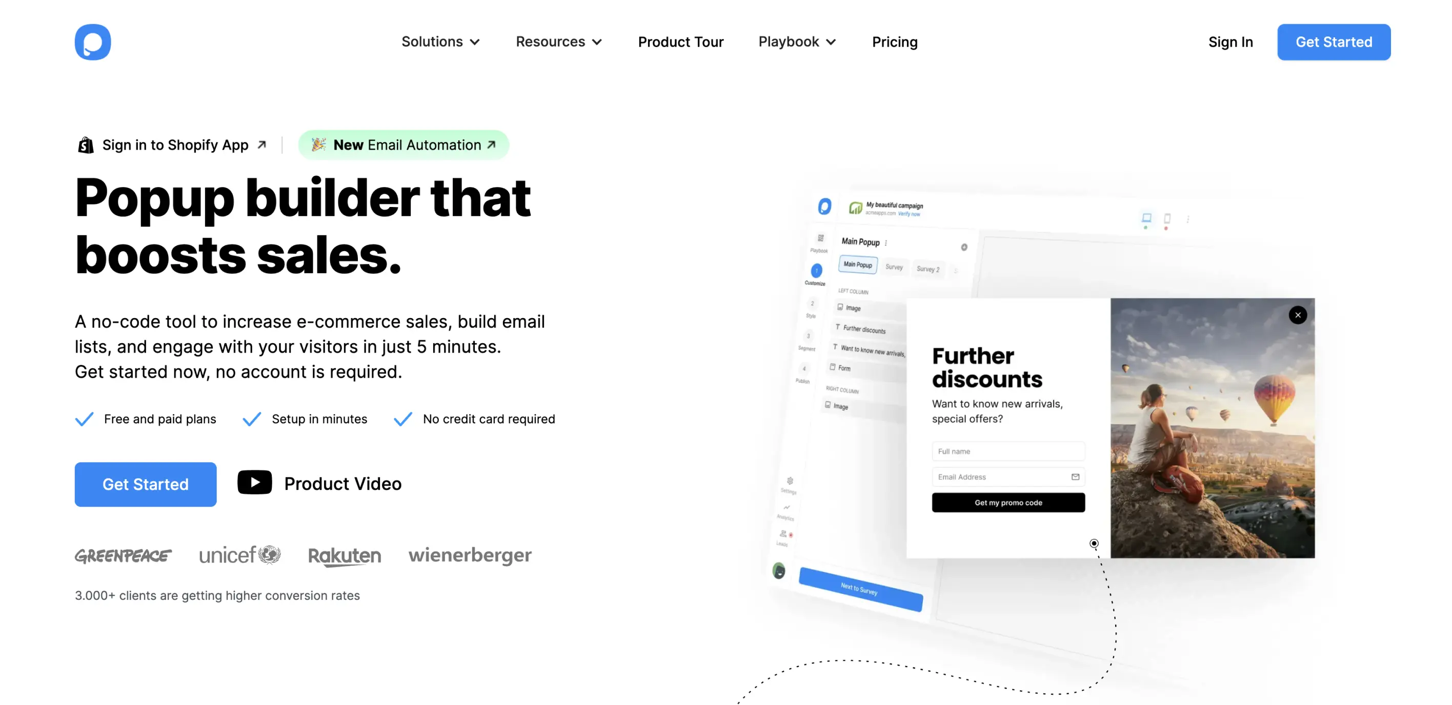
Let’s look at Popupsmart, a versatile popup builder software designed to enhance online marketing efforts by boosting sales, signups, and conversions
Its user-friendly interface and customizable features enable businesses to create targeted and effective popups that integrate with their website.
Why it works
- Conversion Enhancers: Positioned just beneath the introductory segment, Popupsmart effectively highlights key features aimed at boosting conversions. These include options for both free and premium plans, the promise of quick setup, and no necessity for credit card details.
- Social Proofing: There is immediate use of recognizable logos of brands such as Unicef and Greenpeace, which builds user trust right from the hero headline.
- Animated Demonstration: As users delve deeper into the page, they encounter a polished animation showcasing how the software operates, providing a clear, visual understanding of its functionality.
04. Builder.ai
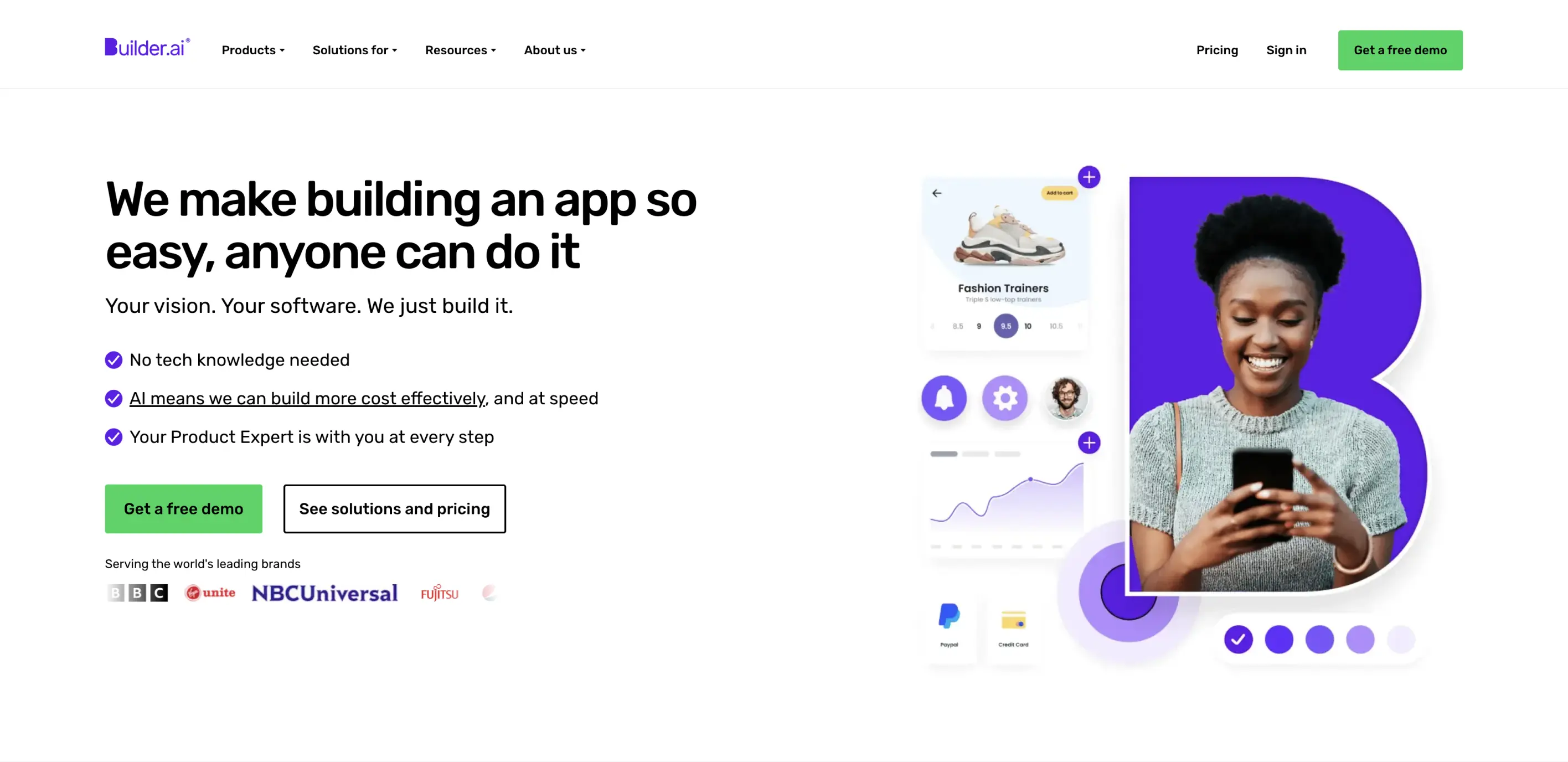
Builder.ai is an artificial intelligence-powered software development engine that helps businesses develop the applications they need. Its intuitive interface and collaboration with industry giants like Microsoft make it a go-to choice for efficient and user-friendly software development.
Why it works
- Key features: This SaaS landing page example clearly points out the most interesting features, ensuring that users know exactly what sets the company apart.
- Engaging sectioning: The design addresses different user needs with an engaging drop-down option to filter information and benefits based on their needs.
- Mobile-Friendly Design: Despite its content-rich landing page, the design remains uncluttered and well-organized on mobile devices, enhancing user experience.
05. Ceros
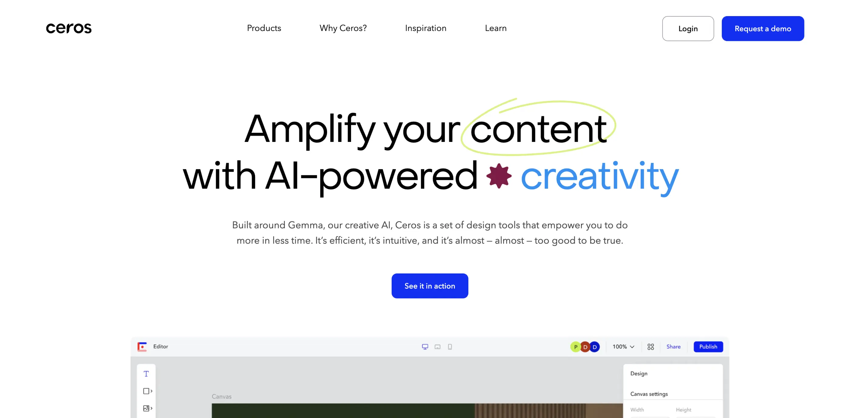
Ceros is an innovative content creation platform that enables designers and marketers to craft engaging, interactive digital content without the need for coding.
It has an impressive clientele including BuzzFeed and McKinsey & Company and offers a canvas for creativity that brings ideas to life with dynamic and immersive web experiences.
Why it works
- Dual CTA Placement: Ceros tests the effectiveness of CTAs by placing them at the top and bottom of the page, assessing which location drives more engagement.
- Brand Endorsement through Logos: Showcasing logos of famous brands that utilize Avocode near CTAs instills confidence and encourages conversions.
- Educational Product Videos: This SaaS landing page example integrates short videos and animations to illustrate the ease of the SaaS product uses.
06. AirTable
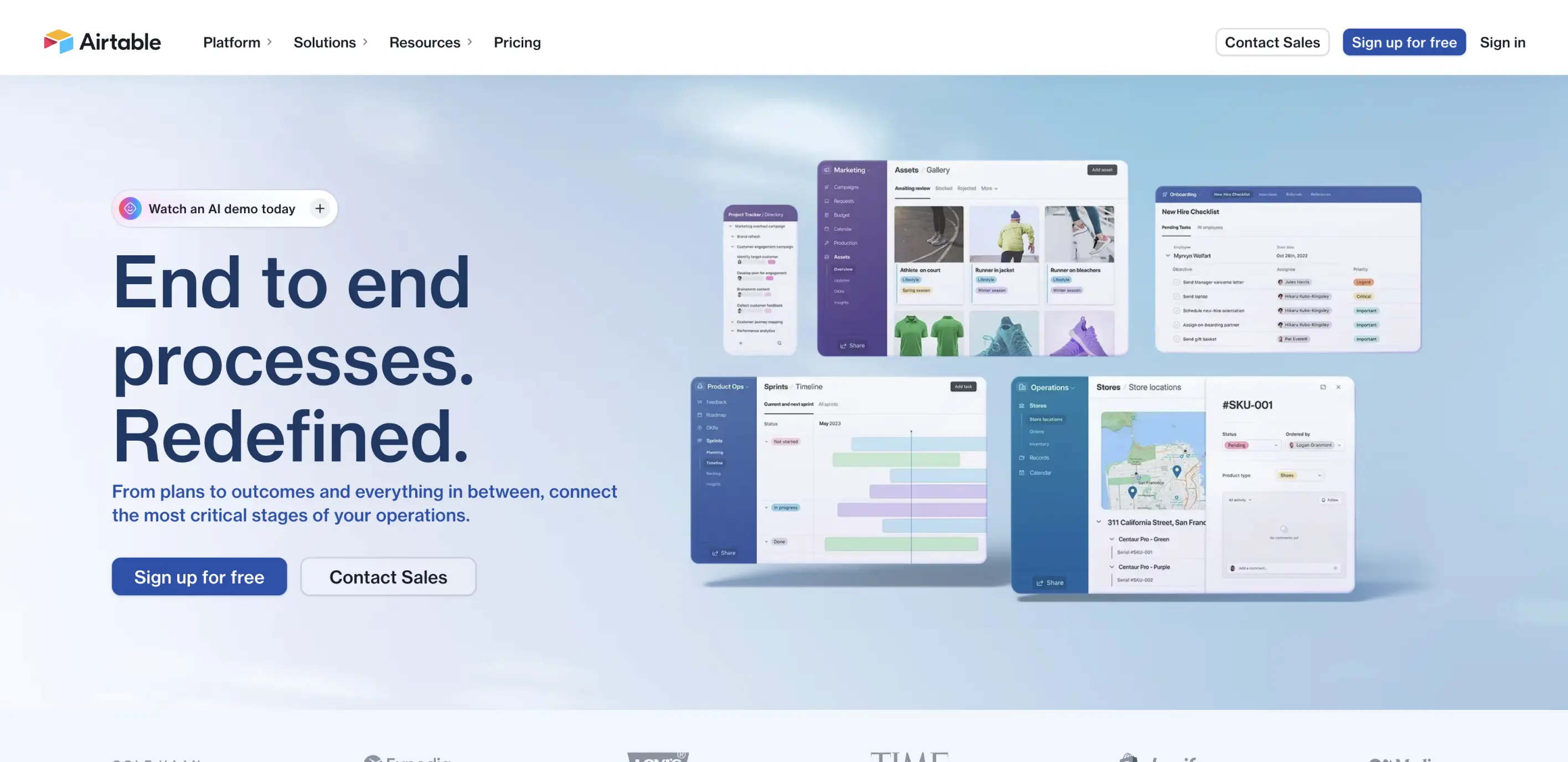
AirTable is a fun and flexible app that turns your ideas into awesome projects and collaborations, making project organization super easy and creative. It's a big hit, with over 300,000 companies around the world using it to keep their projects and teams in sync.
Why it works
- Trust through Brand Logos: The landing page gains credibility by showcasing logos of renowned clients like Medium, TIME, Buzzfeed, and Netflix.
- Animated Demonstrations: Animated demos on the site vividly present the software’s interface and capabilities.
- Clear Value Proposition: The landing page’s headline is minimalistic, catchy, and straightforward, effectively summarizing what the software offers and guiding user focus to the CTA.
07. Monday.com
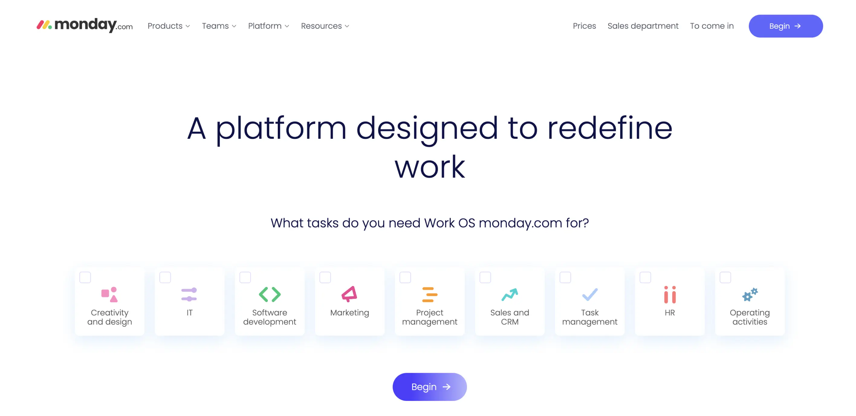
Monday.com is a versatile project managing tool that allows teams to run tasks and workflows efficiently. Catering to over 125,000 customers worldwide, it offers a flexible platform that adapts to the diverse needs of teams across various industries.
Why it works
- Personalization: The company boosts conversions by offering a choice of tools right away, tailoring the experience to each user's interests, and showcasing the most relevant features.
- Real-World Examples: The page displays various project and workflow examples, helping potential customers visualize how they can use Monday.com effectively, which encourages sign-ups.
- Credibility Boosters: Featuring testimonials and logos of well-known companies, the landing page builds trust and credibility, making new visitors more likely to trust the brand.
08. Writesonic
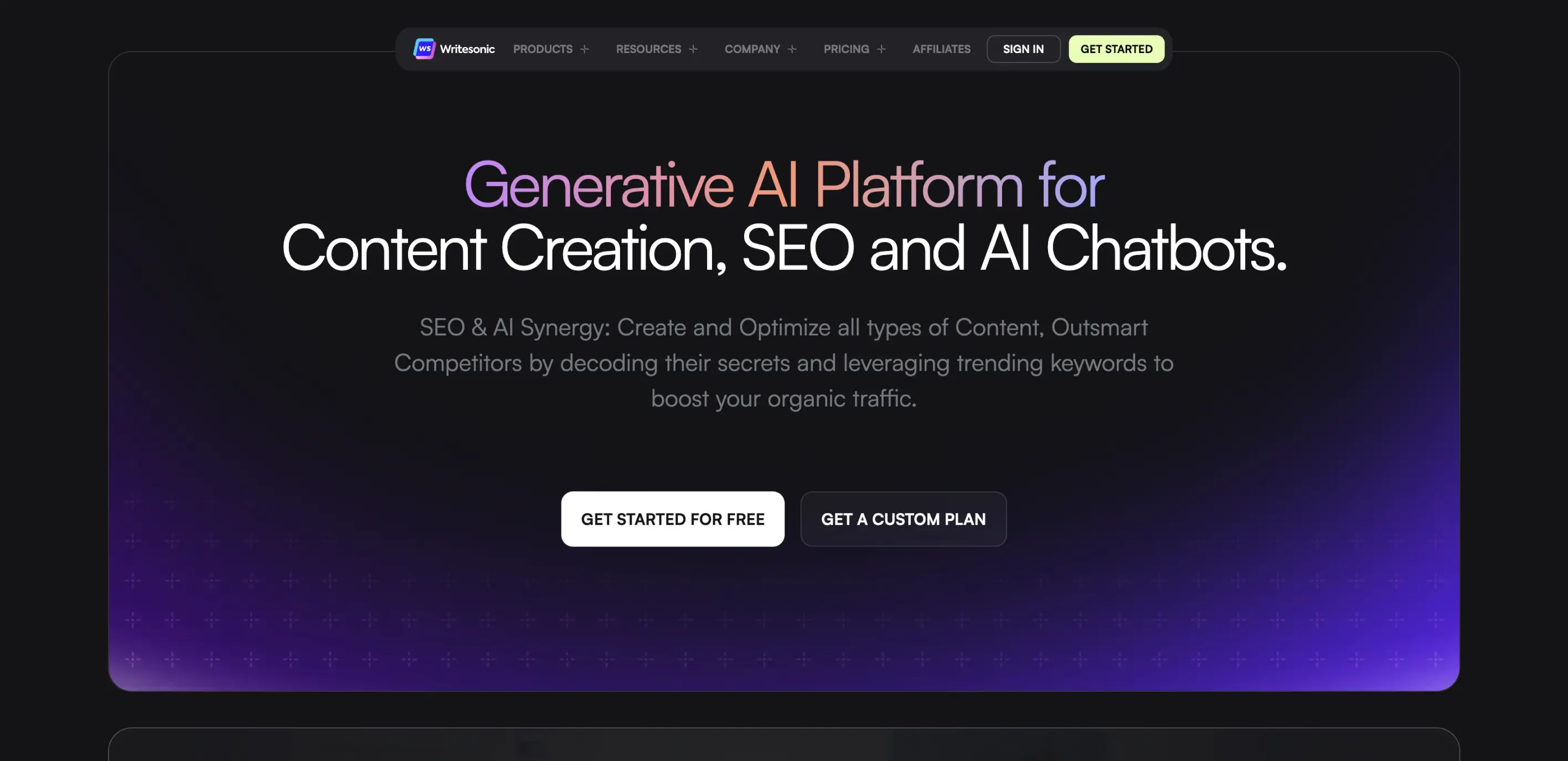
Writesonic is an advanced AI-powered writing tool designed to help content creators, marketers, and business owners generate high-quality content. Boasting a growing user base, Writesonic currently serves over 750,000 users worldwide. So, what makes this SaaS landing page example so effective?
Why it works
- Visible CTA Placement: Contrasting and strategically placed call-to-action buttons on the landing page instantly draw the user's attention, guiding them towards key actions like signing up for free.
- Success Stories: Featuring motivating success stories of users who have achieved remarkable results with the SaaS, these testimonials not only inspire potential customers but also solidify the product's effectiveness and value proposition.
- Awards Build Trust: The company shows off its 2023 awards directly on the landing page. Showcasing the company’s achievements is likely to improve user confidence in the service and help them commit to an action.