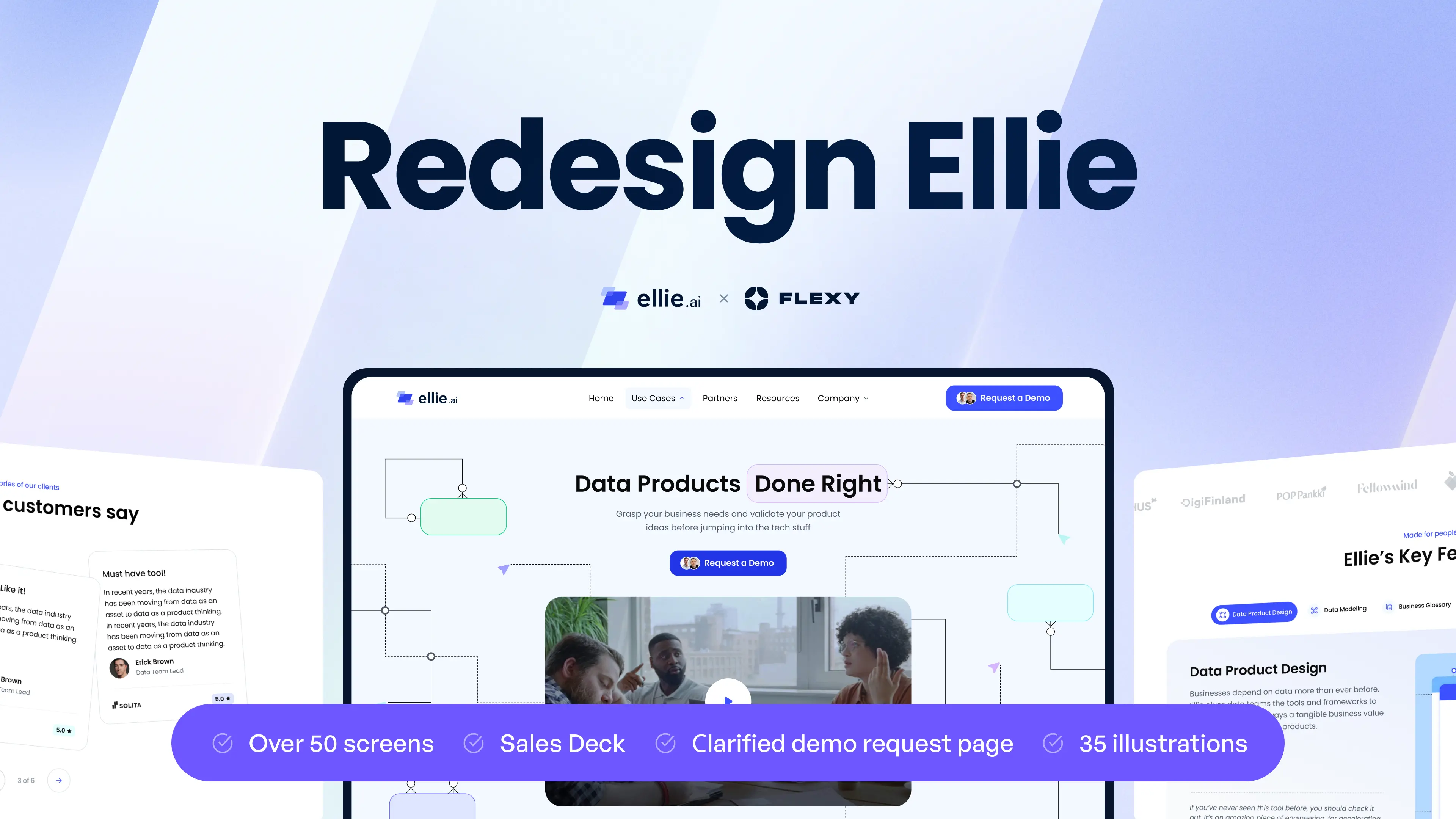
Flexy's winning formula - Mastering the art of rebranding Ellie.ai's website
“Finding a design agency like Flexy is like winning the lottery! Having worked with many agencies in the past, I was amazed by the quality of work and execution received. You get a whole team of experts in various design fields, who pay attention to every detail of the project and closely work with you through every step of the way. There's also a very clear process in place, and as a result, you always get an S-tier outcome when working with the Flexy team.”
— Stan Dmitriev, Head of Marketing at Ellie
Do you ever feel lost in all the data types that flow from sales, customer data, online insights, and leads? Currently, so much information flows in and out that files and charts are simply not enough. Unfortunately, data charting tools are either very technical and take too much time to learn or are too basic, lacking necessary features.
Ellie is a multipurpose data modeling tool or, as the company’s Head of Marketing, Stan Dmitriev, likes to say, "Ellie is like Figma for Data Teams." They approached us with a task to rebrand and redesign their landing pages to suit Ellie’s innovative goals.
Let’s take a stroll through the project together and find out interesting UI/UX facts
What is Ellie.ai?
It is a SaaS startup company that offers cloud-based visual diagramming software for data teams. Ellie.ai’s data modeling and information architecture features are lightweight and easy to master for individual and enterprise use.
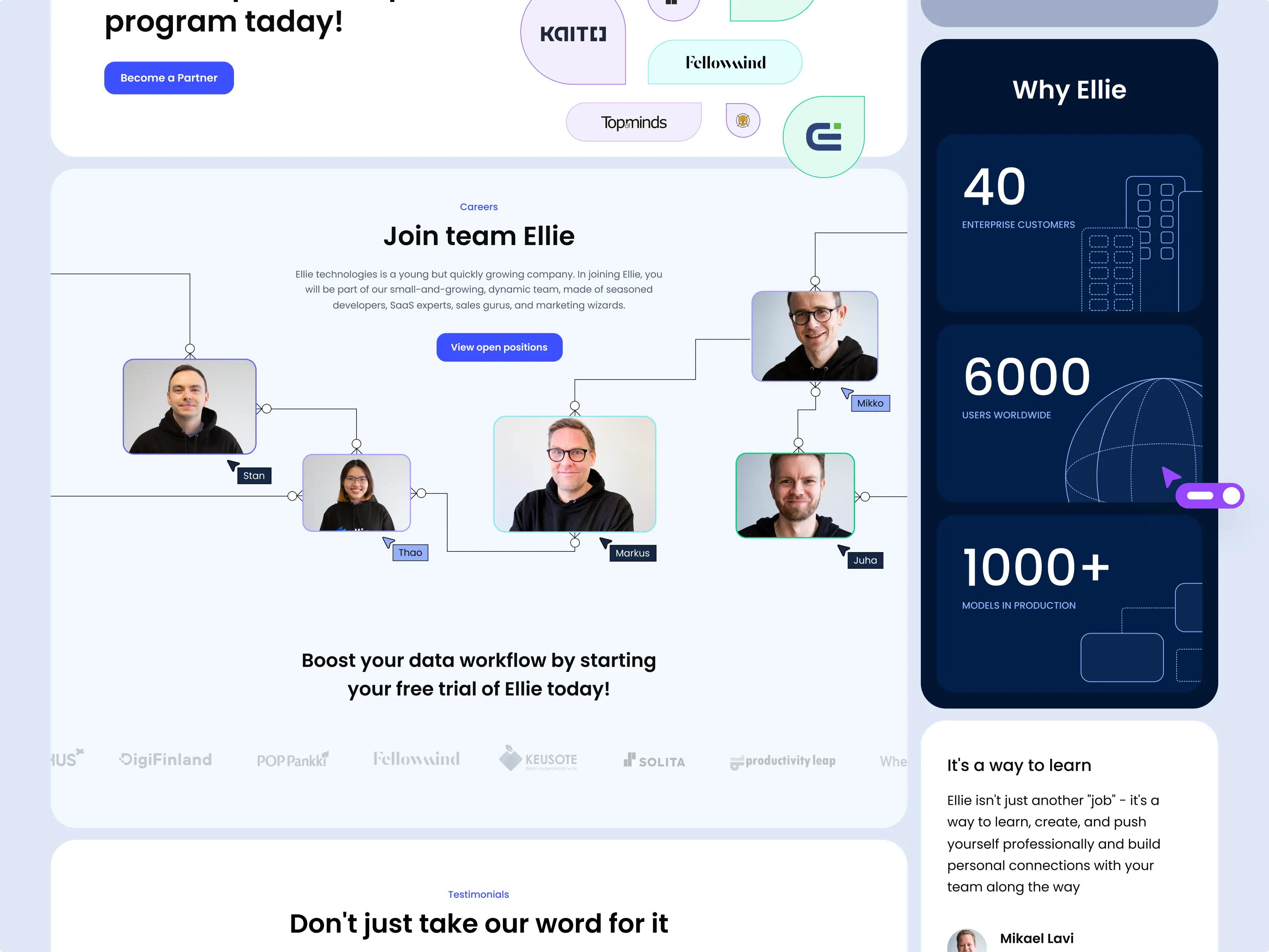
The company’s goal is to help users from any background and industry map out their data workflow more efficiently than ever before and it is successfully achieving its mission while growing its clientele with over 6000 users and 40 enterprise customers.
Our challenge
The more flexible your brand is to your consumers' needs, the more reliable and relevant you will be in their eyes. Every $1 invested in UX design gives $100 in return, and giving your UI/UX a makeover can clarify your brand identity as a digitally advanced, adaptable company and improve conversion rates.
Flexy designers faced a task to rebrand Ellie and upgrade its website to better reflect its product’s innovative value and strong technological positioning.
The scope:
New brand identity; Illustrations; Landing redesign; Use case template; Blog & Article template; Company pages; Sales Deck; Demo request page; Webflow development.
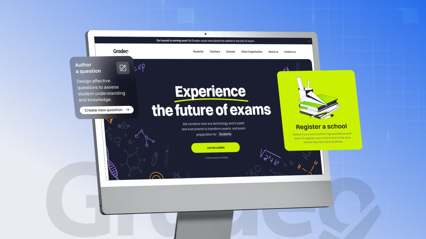
Take a look at Ellie’s dramatic transformation before and after Flexy’s rebranding and UI/UX redesign.
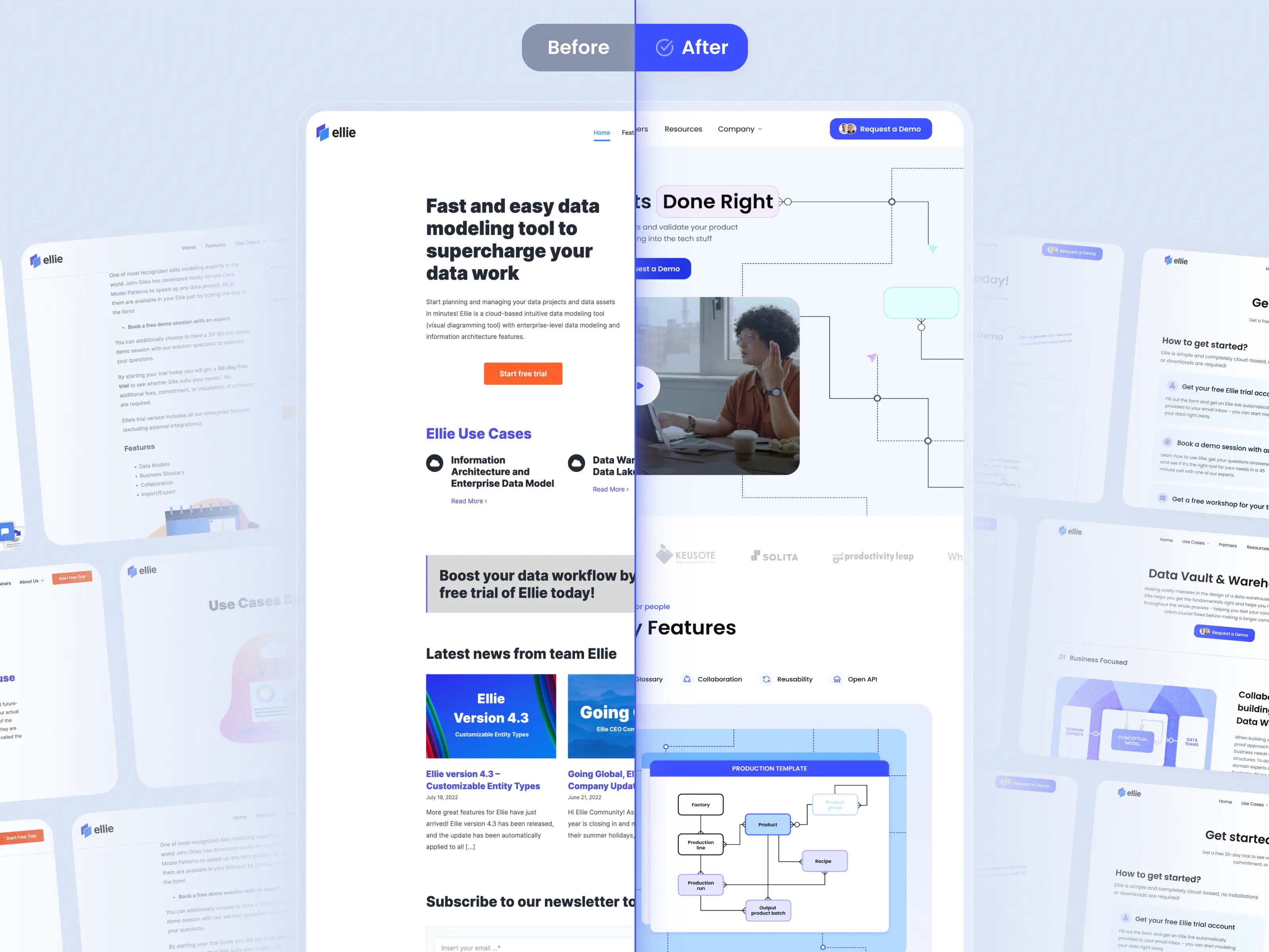
Rebranding: Advanced tech company made accessible to all
To change the way people think about a brand, their associations, and their emotions, we need to transform their interactions. Users tend to judge digital companies by their cover, it only takes 7 seconds to form an impression about your software, application, or website.
Following our client’s wishes, we did not stray far from the original dual color palette and used it to Ellie’s advantage. The new brand image must be familiar to users, otherwise, they won’t form the needed associations, which are most important for brand loyalty and customer lifetime value.
Flexy designers used the color palette as a symbolic element in the new logo. The two trapezoids in the original logo were split into three to represent how businesses (blue) and data technologies (purple) are bridged by Ellie, who enables easy data visualization and management. The startup is represented by a saturated primary color as an extended metaphor for a reliable, essential entity.
Fun Fact: Blue is the world’s favorite color. These results are as true now as they were in 1940, shown by a study that this color was preferred by people regardless of their origins, beliefs, or age. This color is now associated with many technology brands, possibly because it represents cold technological intelligence or, as researchers found, it is associated with positive things.
The User Interface design follows this industry trend, using color psychology and user behavior to shape a friendly, community-oriented, and creative design.
Visuals are often more persuasive because they allow the audience to see why the product is useful for them and encourage them to imagine using the product themselves.
When your UX/UI is smooth like butter, showing it in action also removes any misconceptions or prejudice users might have about similar tools being difficult to use. This can go a long way in winning over apprehensive first-time users and jaded prospects who churned from your competitors.
With an engaging, animated homepage, users can easily view all the main features in action. The Writesonic product has over 100 features and the company has put a lot of effort into developing them, so it’s crucial that no value is lost through ineffective communication.
Here, we highlight the platform’s use cases such as AI tools, SEO optimization, marketing, and application across top platforms like Facebook, Google, Twitter, Quora, and Amazon.
Another objective of a good UI design is to visualize the company’s message, mission, and offers. Read on to find out how we made an idea two-dimensional.
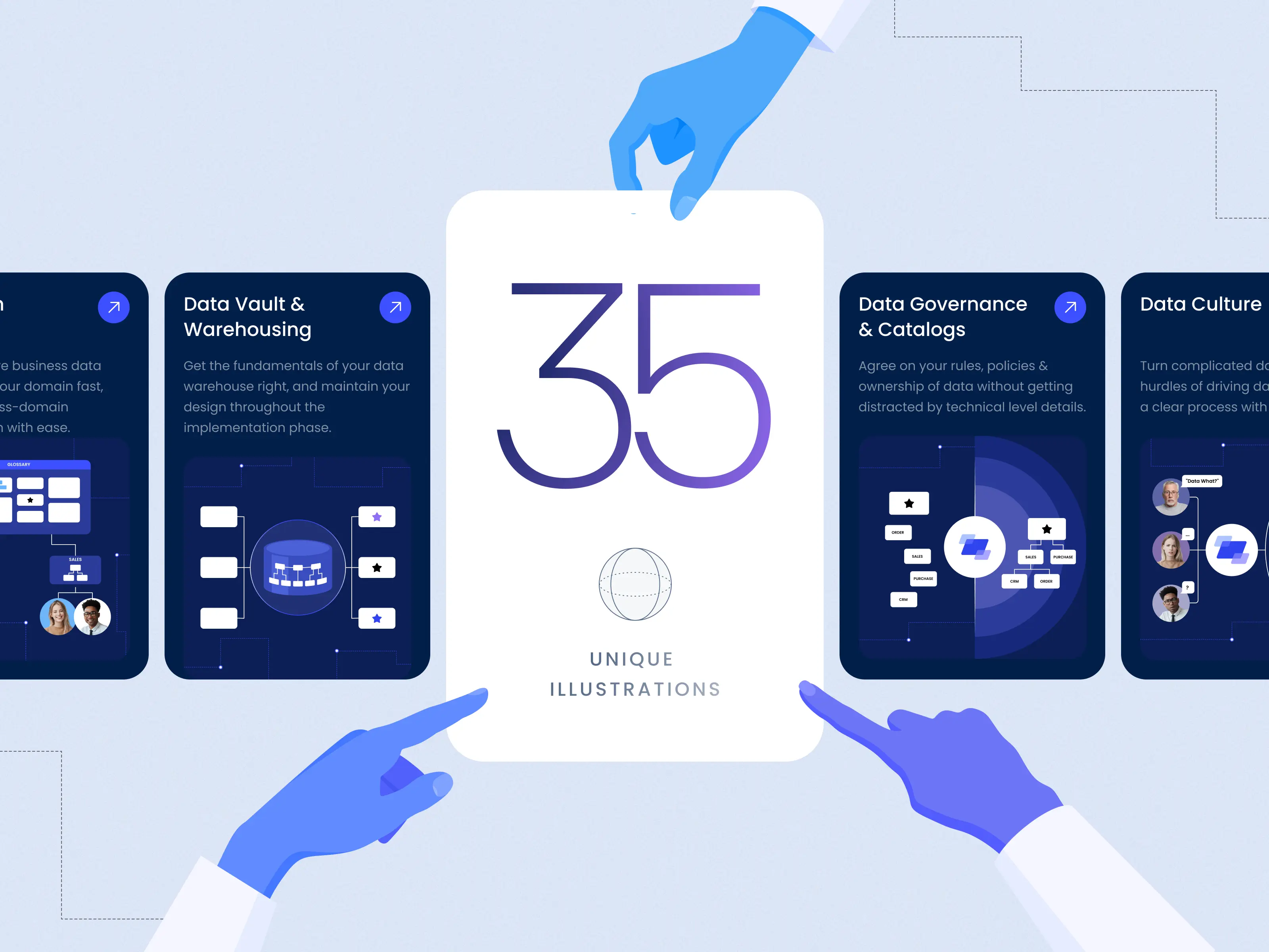
Convert processes into Illustrations
Images are the fastest medium for transferring information and have been used throughout human history, dating back to cave paintings. Illustrations are just one method of visually encoding messages, most of which are read subconsciously and extend the average visit duration.
Flexy designers created an incredible collection of 35 unique illustrations for this project!
These illustrations fulfilled three core roles: Showing exactly how Ellie can be used, engaging users in the process, and hinting at what the brand is about.
The main idea was data connectivity, organization, and flow. We developed this concept into a series of geometry-themed illustrations.
Next, find out how a motionless landing page can be converted into a dynamic and interactive exhibition of brand value.
Create an interactive homepage
Digital screens conditioned our minds to keep scrolling down, but if you want the user to eventually make a decision and act, a linear website format can tire the eye and disengage the focus. Psychological research found that humans remember things better when they interact with or think about what they see in front of them.
The original homepage was very linear, and some information could only be found after clicking to “learn more.” This is a common practice among companies that have a lot to offer but are not sure about where to add content without overwhelming the reader.
“The time it takes to make a decision increases with the number and complexity of choices.”
— Hick’s Law
Did you ever hear of the psychological principle called Hick’s law? It says that less is more. By organizing the landing page hierarchically, Flexy made the User Experience easier and cut the time needed to make a decision. All necessary information is made immediately available on the landing page so users won’t be discouraged from having to open separate pages for each feature.
Instead, they are encouraged to interact with the page and have immediate access to the feature cards. Flexy designers deliberately added horizontal features like the opening slide with an explainer video, a customer logo carousel, and interactive cards with custom illustrations.
Read on to learn about the importance of UI/UX design templates.
Cut time to market with templates
At Flexy, we make sure our client’s needs are met and that their team can easily integrate our design.
Design templates are like a blueprint of the UI/UX design that can be used to add new pages or content to the digital product.
We provided Ellie with 5 use case explanatory pages based on one reusable template so that our client can independently produce new content with different copy and visuals and cut their time to market.
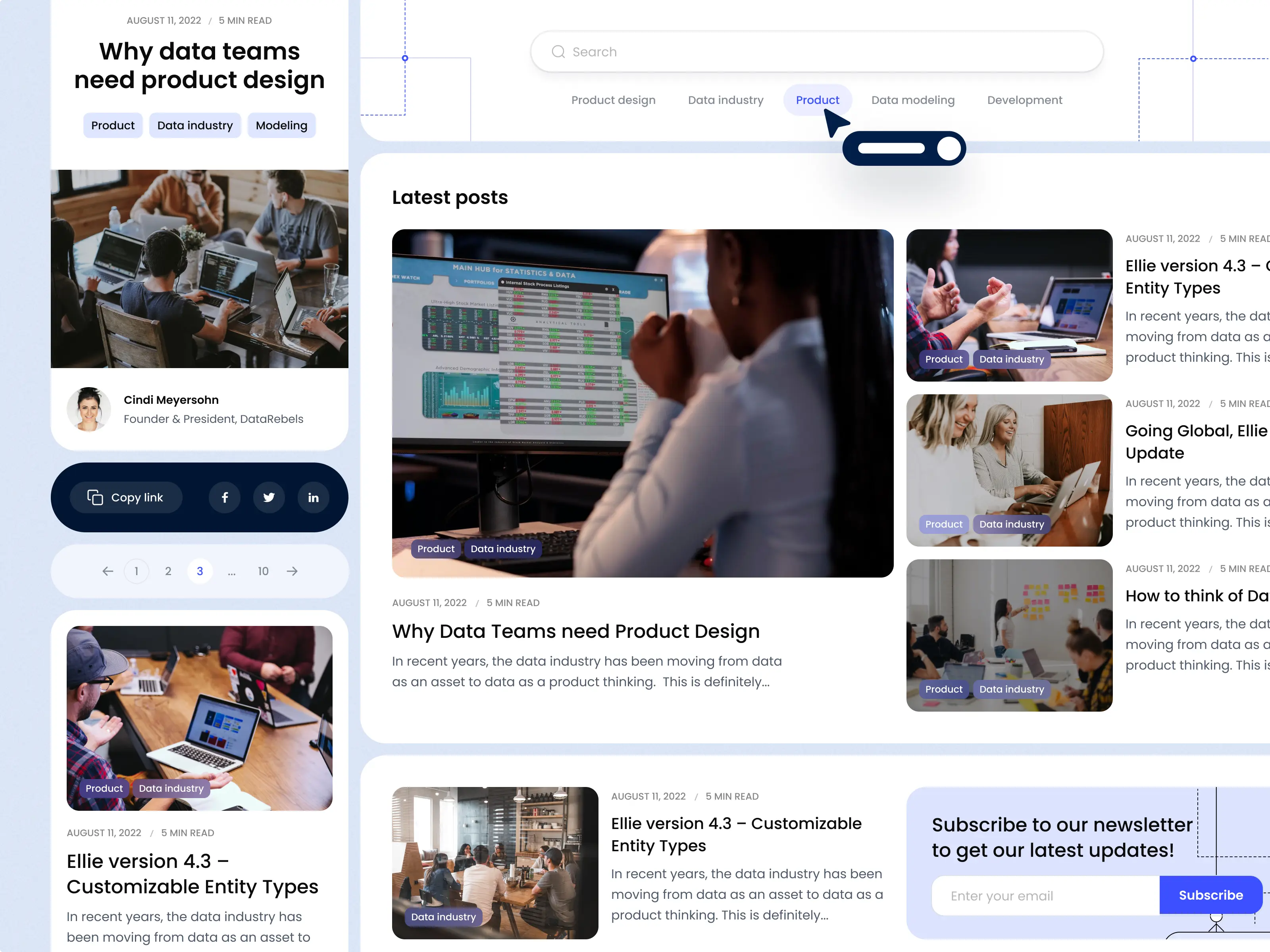
Optimize your blog experience
Ellie has a neat blog where it posts about industry trends and company news. Its articles hold useful tips on data management and key software update announcements that needed a common design trait, something that would make each element ring with Ellie’s brand identity.
Consistent design elements and UX are critical in building a strong, recognizable brand in the highly competitive technology market.
Visual consistency was created using segments from the illustrations made for Ellie’s landing pages, linking all article templates under one UI.
Internal consistency was achieved using a familiar page layout and CTA statements throughout the website, helping users easily navigate and have a smooth journey.
External consistency is about using familiar UI and UX coupled with the page's purpose. For example, Flexy designed Ellie’s blog with an easily accessible search bar and article cards that are common on blog sites.
Next up, we talk about CMS (content management system) software and how it can help you build and publish website pages.
Managing pages with Webflow
CMS software transformed the website content-update process. One of the main advantages of using CMS is the shortened time to market, which is responsible for your competitive advantage.
Content management platforms are made up of a content management application (CMA) that allows content management and a content delivery application (CDA), which stores and displays content.
Webflow is a website builder with a CMS tool that Flexy used to take care of the website’s content update and cut development time. Its process is quick and accessible to even non-tech-savvy users thanks to its gamified, drag-and-drop format.
Unlike alternative website-building platforms, Webflow does not restrict web design to set templates, allows content edits directly on the page, and can be used to make your website mobile-friendly. And all that with little to no code!
Raise brand loyalty with transparent UI
Although we used the word ‘transparent’ we aren’t talking about glassmorphism, which is a glass-like UI design. We mean transparency in a company’s mission, tone, imagery, and mood.
Consumer trust is a growing issue. Approximately 85% of users prefer companies that are transparent about their goals, achievements, and processes. In the new digital era, you are no longer selling a product but rather the idea behind the company and, to be successful, you need to involve your audience in your mission.
Some of the less visited pages on a website are the company pages: About Us, Partners, Contact Us, and Careers. To make these pages more welcoming, Flexy used a simple psychological principle –- visual narratives.
A visual story can drive retention and is processed much faster than text content. Using photos you can immediately reveal the company's life, its goals, and the team’s vibe. No matter what you have on your webpage, if there is a photo with people on it, users involuntarily look at their faces and facial expressions.
This action directly affects the user’s impression of the brand, so, if your team smiles in the photo, users will mimic their mood and have the impression that your company is filled with positivity.
You can see this principle in action when Ellie’s merry team is featured on the About Us page or on the Careers page where an illustration symbolically links members together. Unfortunately, the illustration could not be displayed in its full size so we included photos inside the CTA buttons instead.
The user is even briefly introduced to life at Ellie, creating an inviting environment before the user even looks at available positions.
For more interactive social proofing, Flexy designers created a dynamic Partner Page with a vibrant CTA banner and a list of Ellie’s partners linked to their websites.
Transparency is also part of Ellie’s sales plan. Read on to learn how a free trial can shorten consumer learning curves and retain thousands in long-term revenue.
Encourage commitment with a free trial
Many users might be unsure about paying for a product or service, especially if it suggests long-term commitment.
One way to reduce consumer fear about long-term commitment is by offering a free trial. Ellie also proposes a demo session and free workshop options. Other benefits of a free trial are that consumers gain first-hand experience to better understand your product or service and you, in turn, receive valuable feedback.
Flexy’s task was to design a page containing a trial request form with engaging text and visuals to help with conversion. We also included Ellie’s main features for users to skim over its advantages and make a quicker decision.
Next, learn about common sales pitch mistakes that can cost you a deal.
Win more deals with a branded sales deck
A sales deck holds a sales narrative and visual evidence of value, which is necessary for pitching your product or service. When done right, you win the biggest deal of the year. When done wrong, you might lose a valuable client.
Some of the common design mistakes include:
A non-branded design; is the absence of a storyline to highlight the brand value; focusing on features instead of benefits; crowding slides with text.
Our challenge was to create an insightful and persuasive sales deck.
We created a design illustrating common data management problems and the simple solutions Ellie has to offer. Key benefits of using Ellie’s data modeling software, use cases, and insights were coupled with custom illustrations and diagrams for better visual retention.
If you liked this case study and want similar results for your brand Flexy Global is up your alley.
E-mail us at ✉️ friends@Flexy.Global