Stimulating Writesonic's traffic with a total redesign
“We’ve been receiving great feedback from customers regarding the new design of our website. Also, we’ve noticed improvements in terms of traffic and conversion rate.”
— Samanyou Garg, CEO at Writesonic
Have you ever wondered if there is an easier way to come up with marketing copy and social media captions? AI writing assistants have all the tools you need. They are a revelation for writers, marketers, copywriters, and entrepreneurs alike.
Writesonic, who are leading and transforming this fast-growing high-tech industry, came to us with the task of creating a UX/UI that was as tempting to use as their technology is powerful – mission accepted! So, join us backstage as we redesign this AI writing assistant and share valuable UX facts.
Let’s begin!
About Writesonic
This fast-growing Y Combinator-backed startup is, at the time of writing in late 2022, among the world's TOP 5 AI-powered content generation tools used by over 750,000 businesses and individuals. Now, with its superior features and functionality, and supercharged UX/UI, Writesonic is well positioned to take the top spot in this competitive high-tech market.
The company uses AI to fight writer’s block and helps businesses generate content for marketing, websites, blogging, and more. It has a very active community base and over 10,000 online reviews. Writesonic believes that everyone has a talented writer within themselves. All you need is a little inspiration and a helping hand.
Trusted by Google, Wix, Todoist, Spotify, Moodle, Mariott, Rakuten, Genesys, and others.
"Best AI writer of 2021-2022"
— according to TechRadar
The challenge: an attention-grabbing design
The sooner you optimize your UI/UX the sooner you can stop fighting to fill a leaky bucket and enjoy a better return on ad spend, retention, and customer lifetime value. Everyone from marketing to customer service will be able to operate more effectively!
Flexy Global was tasked with achieving just that, a total glow-up of Writesonic’s web UX/UI. Keep reading to find out our challenges and solutions.
Scope:
- Landing page design
- Optimized price calculation system
- Social proofing
- Blog
- F pattern
- Micro animation
- Templates
- UI kit
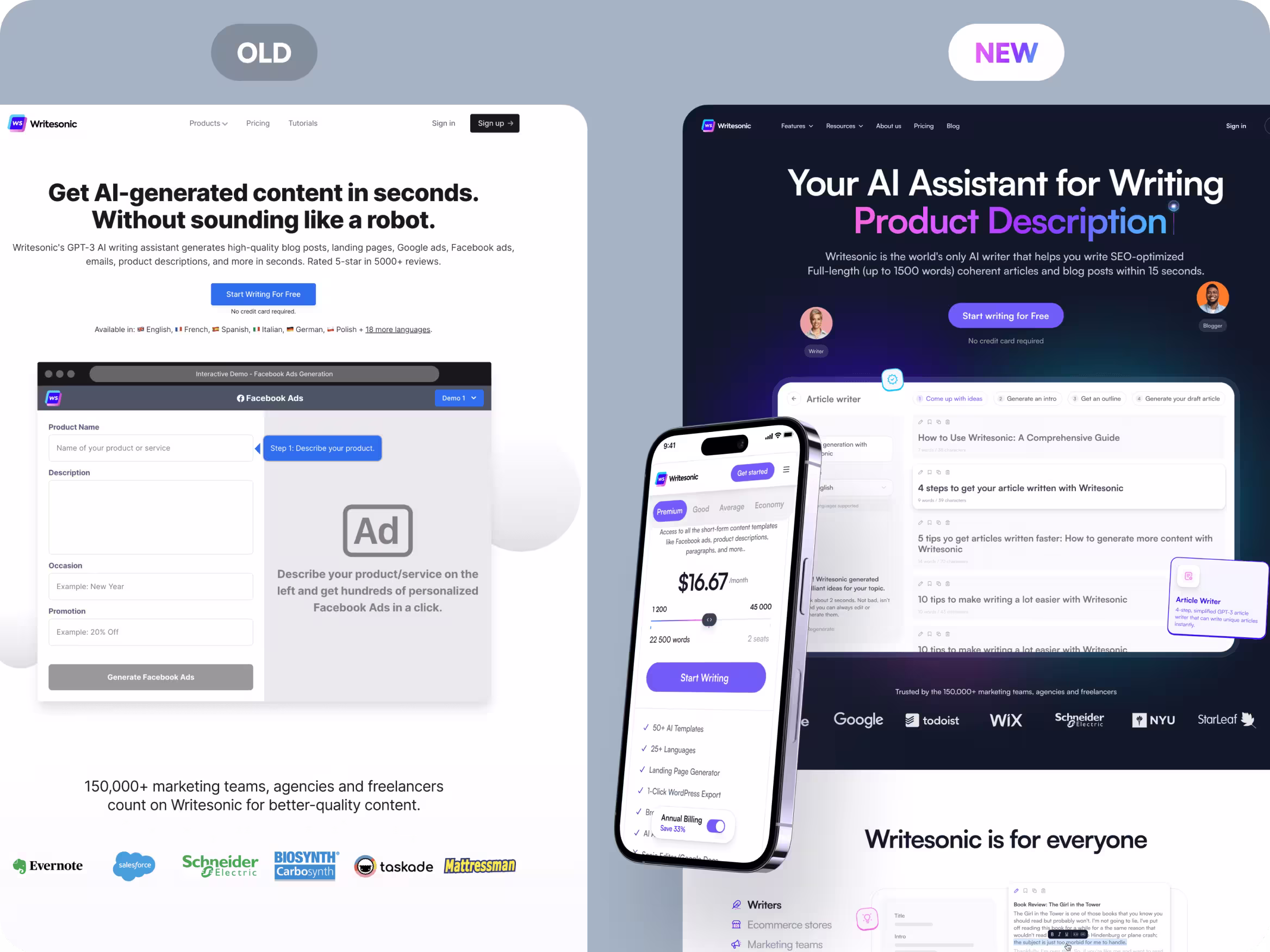
Check out the scale of this transformation in the before-after shot below.
Design in action
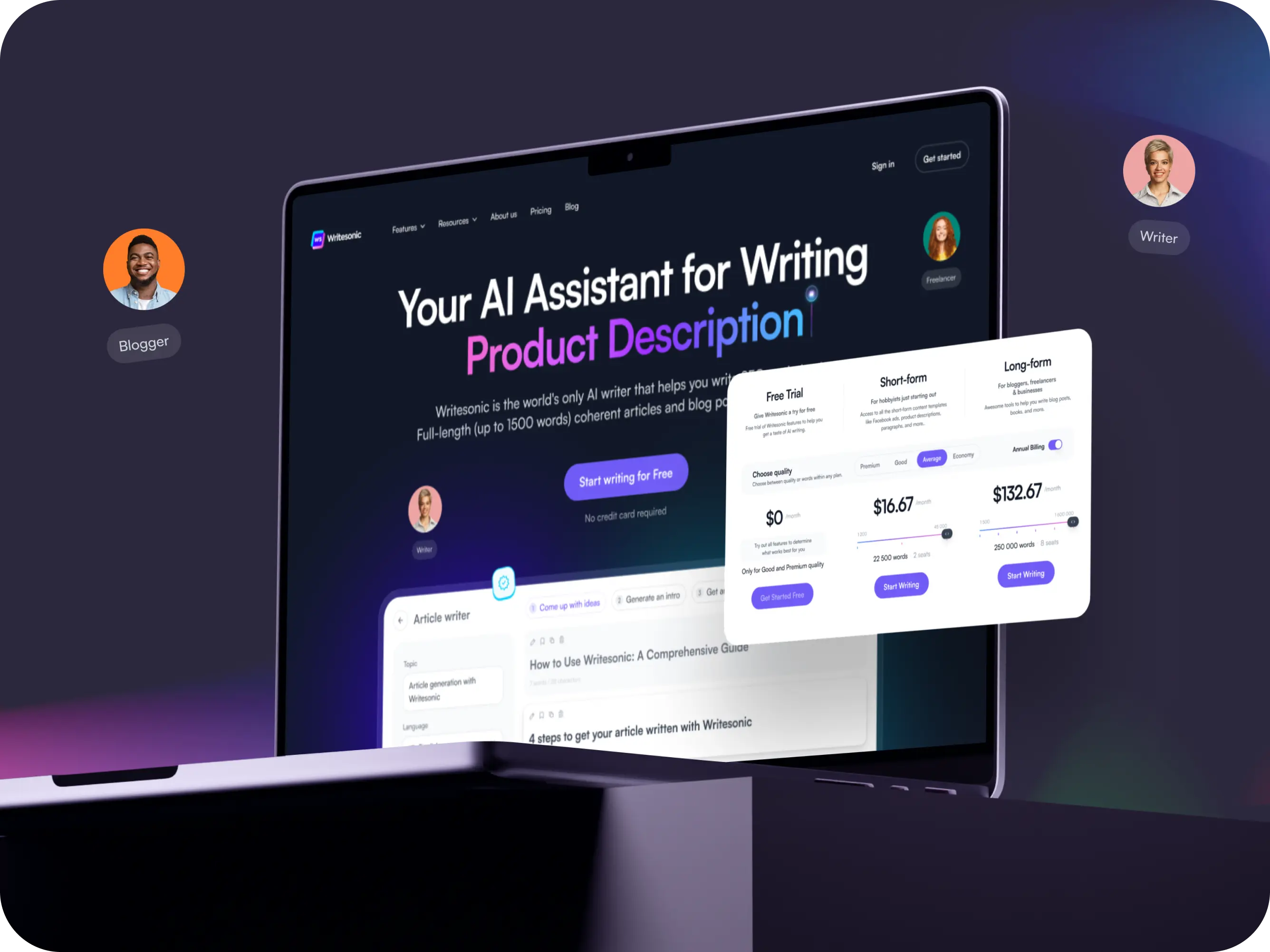
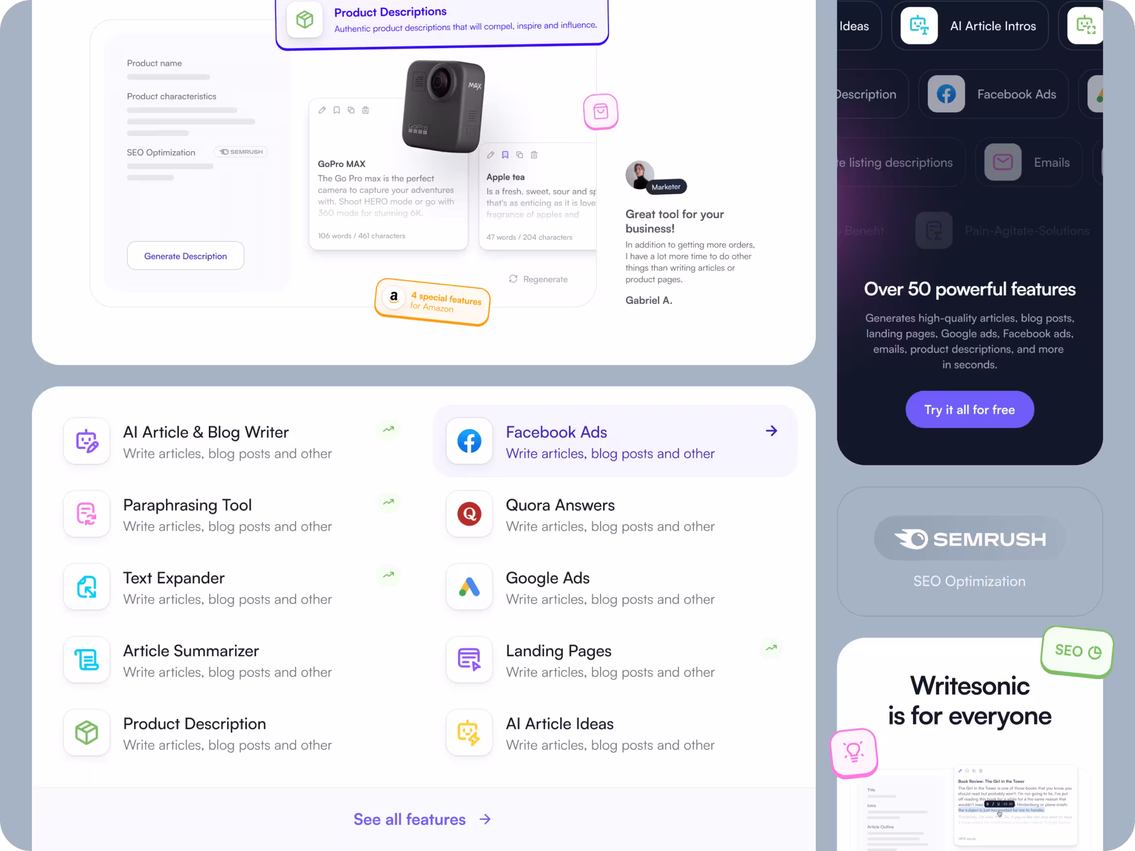
Landing page design features
If you look at the original landing page, some words that come to mind might be “stationary” and “stiff” – and you wouldn’t be alone in thinking that.
Many companies follow a similar formula for their landing pages, and while it’s possible to create beautiful sites within this framework, a few subtle but powerful changes will deliver much better results for your company.
In place of simple feature cards that described Writesonic’s tools, we designed interactive, animated cards that visually show the features in action.
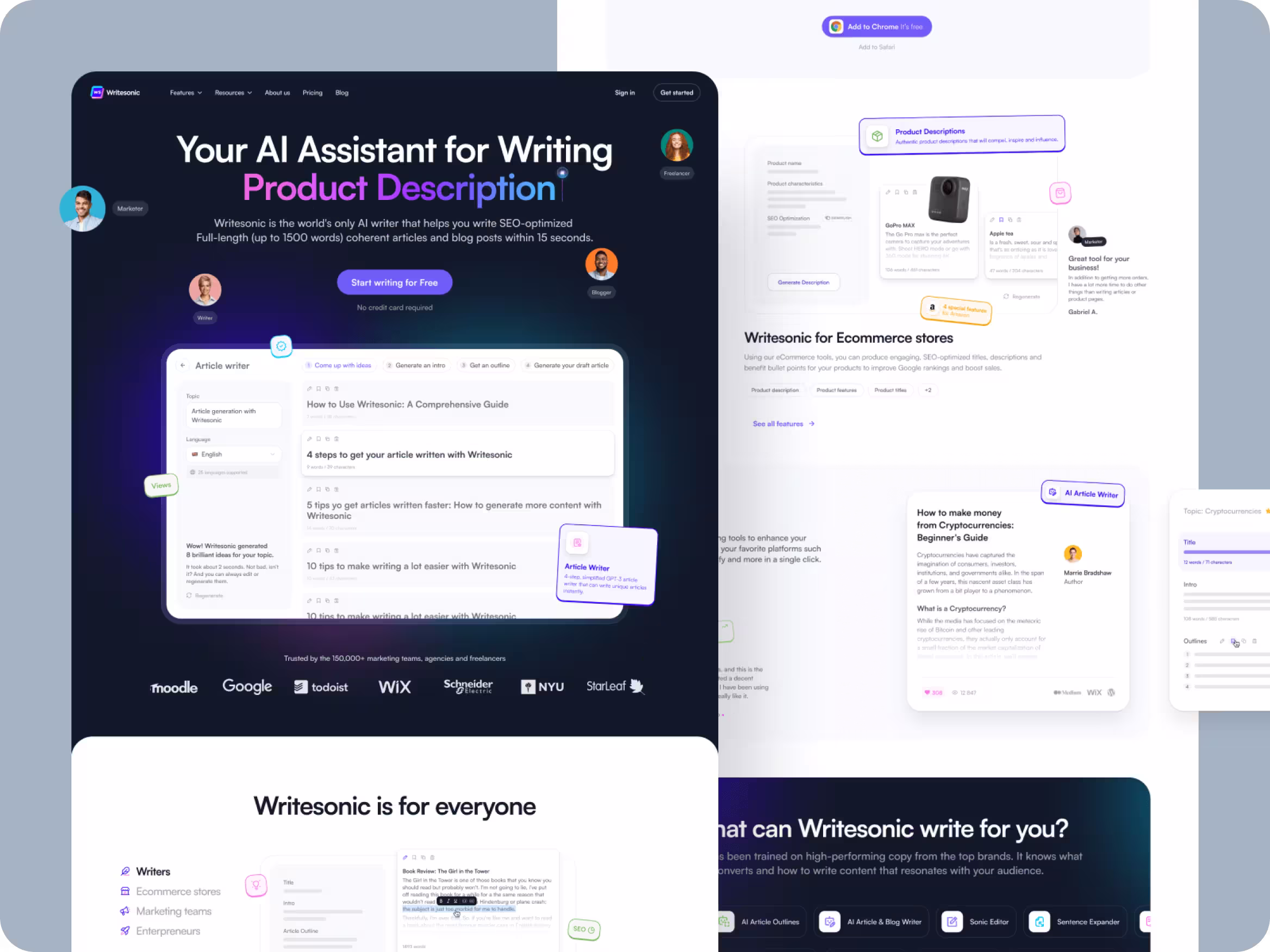
Visuals are often more persuasive because they allow the audience to see why the product is useful for them and encourage them to imagine using the product themselves.
When your UX/UI is smooth like butter, showing it in action also removes any misconceptions or prejudice users might have about similar tools being difficult to use. This can go a long way in winning over apprehensive first-time users and jaded prospects who churned from your competitors.
With an engaging, animated homepage, users can easily view all the main features in action. The Writesonic product has over 100 features and the company has put a lot of effort into developing them, so it’s crucial that no value is lost through ineffective communication.
Here, we highlight the platform’s use cases such as AI tools, SEO optimization, marketing, and application across top platforms like Facebook, Google, Twitter, Quora, and Amazon.
But, we’re only getting started. Next up, learn the pricing mistake you might be making that could be costing your company thousands in customer lifetime value and millions in long-term revenue.
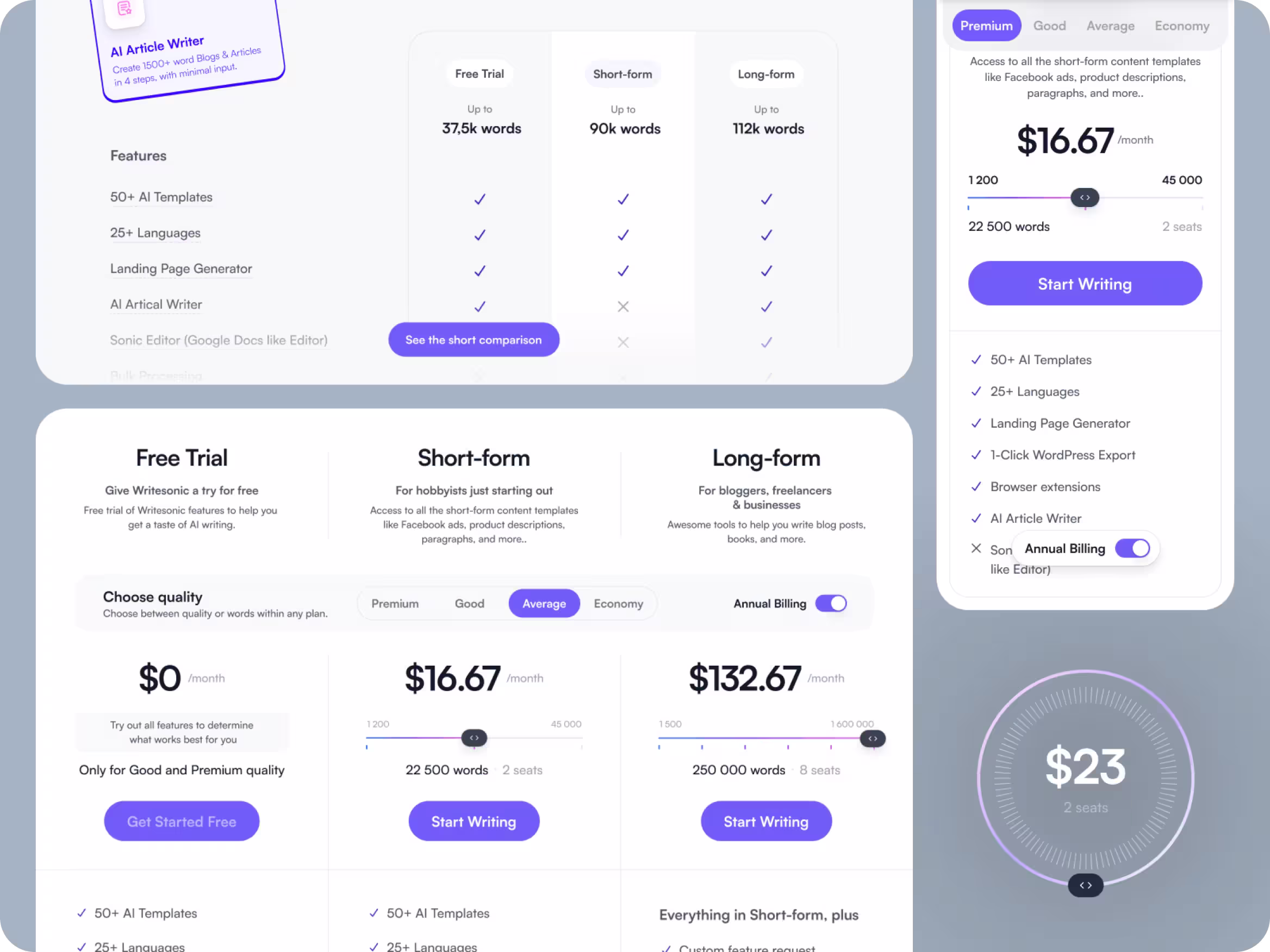
Optimize your brand’s pricing system
The original price list design was strongly based on the Goldilocks Principle, where each subscription card shows a higher price than the last. Do you know the story? When three bears left their porridge to be found by a young Goldilocks, who after trying all three bowls, found one to be too hot, one to be too cold, and the other to be “just right”.
But just like the other two bowls of porridge that weren’t right for Goldilocks, this pricing system might not be the right one for your company if you want to maximize conversions and average order value.
To get it “just right” for Writesonic, Flexy Global developed a more dynamic Price List page with interactive cards that change the price based on the number of words created by the AI and the difficulty level. This is a dynamic feature-based pricing strategy, but here at Flexy Global we call it “Flexy pricing”.
Feature-based pricing allows users to easily choose the subscription that best suits their needs while dynamic sliders give users power over the amount they want to spend.
Users tend to look for subscription comparisons before making a purchase, so, we cut their time to decision by adding a comparison table. To eliminate any remaining doubts, the prices are justified through social proofing using positive customer reviews.
Next up, learn how you can use tactics from one of the most well-known and influential psychologists of the 21st century to get your brand the trust and conversions it truly deserves.
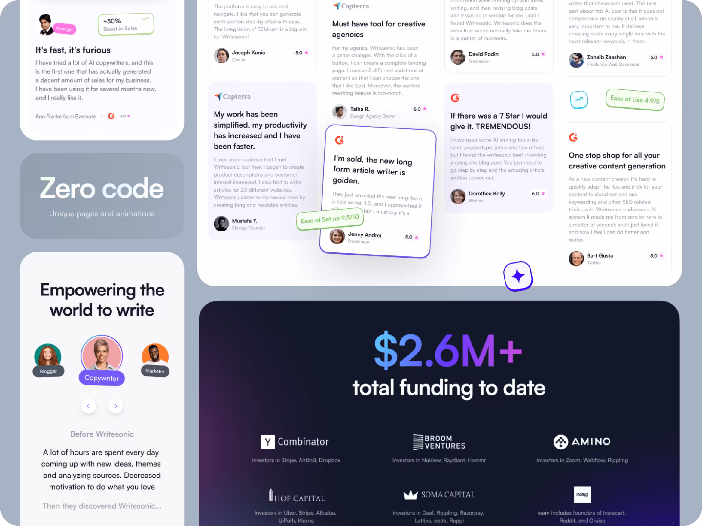
Social Proofing: lead by example
Social proofing is a psychological phenomenon where people copy the behavior of others. The term was first coined by Robert Cialdini in 1984 but is also known as informational social influence.
Basically, the idea suggests that if enough people believe that something is correct, reliable, or valuable the more convincing the belief becomes.
It was easy to apply this principle to Writesonic as it has thousands of positive reviews and responses, all we had to do was display this information convincingly.
Originally, the landing page showed just 3 review cards. We got rid of unnecessary steps and displayed evidence of satisfaction using a handful of reviews, star ratings, and tool ratings.
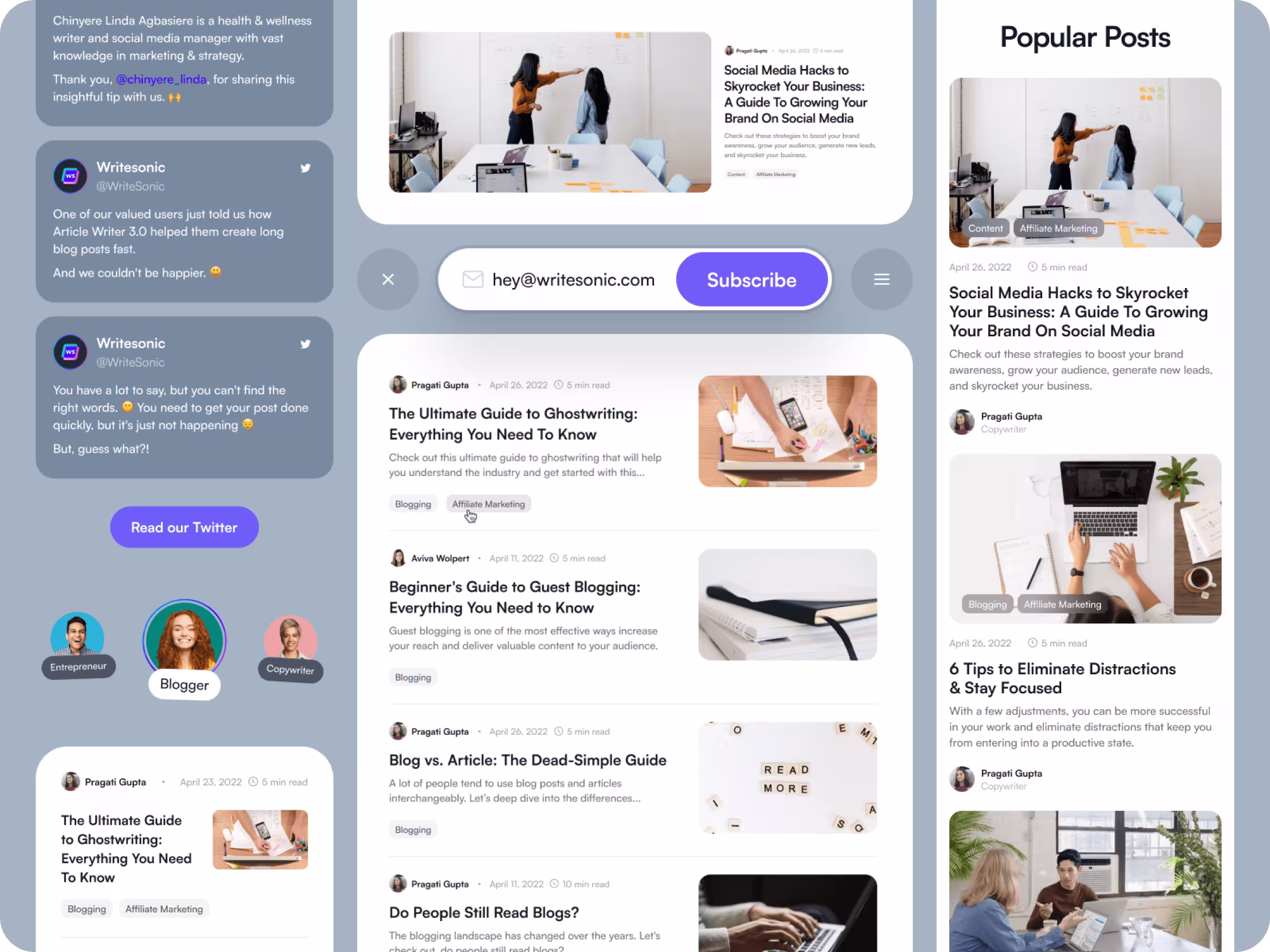
Turn your blog into a powerful tool
Here you see a collage preview of Writesonic’s new blog design and content. The blog section is of particular interest because its AI tools are widely used by individuals from the "writing" industry.
Our challenge was to showcase as many articles as possible, create a newsletter subscription slot, restructure the blog material, and add CTA (call to action) elements. The new design prioritizes trending posts and highlights psychological triggers (CTA buttons) that can boost conversion rates.
Micro-animations with big impact
The new homepage has fantastic animations, super effects, and block transitions. Each block is made with calculated precision and is hyper-customized to interact with the content because we visualized processes using diagrams and micro-animations.
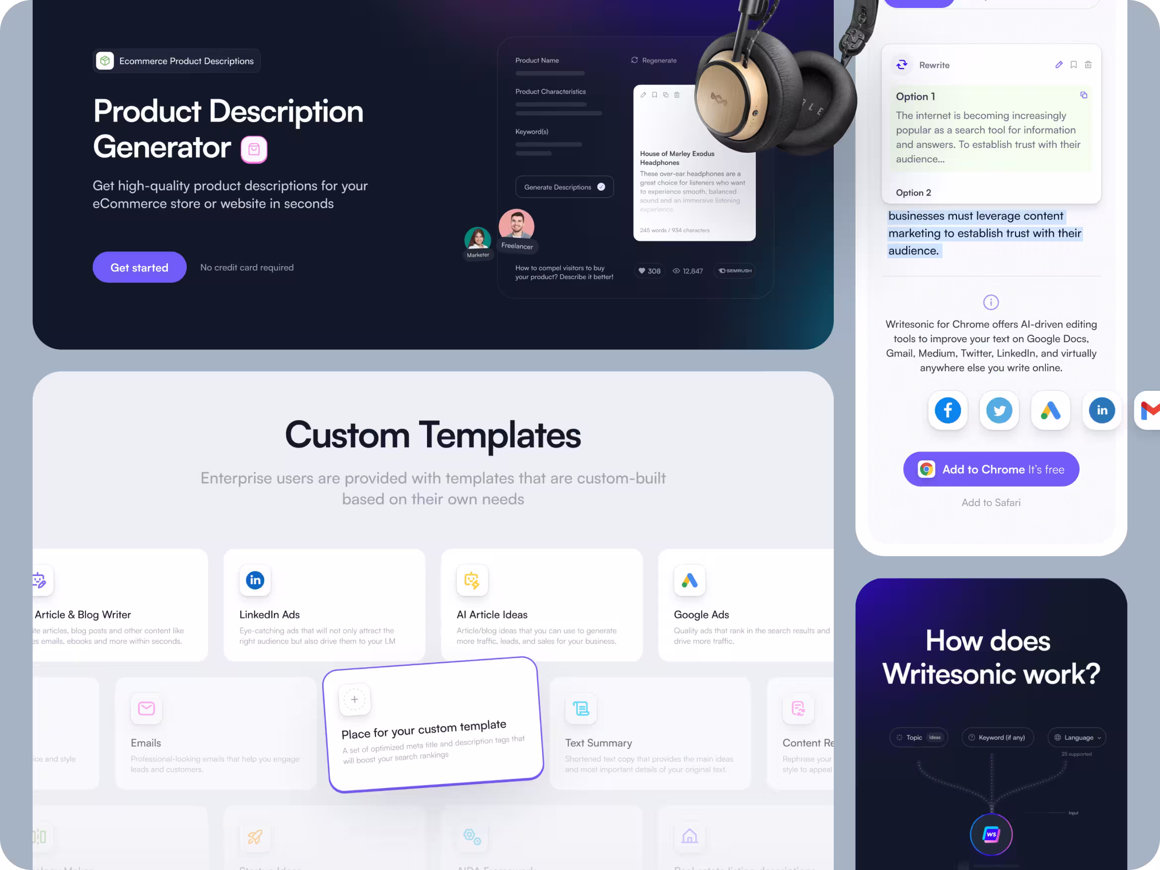
Increase efficiency with templates
The following range of templates were made for Writesonic’s team:
- Templates for Writesonic’s advertising campaigns and announcements, reducing the time to market.
- Optimized feature page animated designs reducing new page development time.
- Article format templates
- Template pages of free AI copywriting tools
- A competitor comparison page highlighting the differences and displaying each competitor’s distinctive features
- Illustrations for 24 tools
The template designs for building new pages were made using Webflow, with little to no coding needed – meaning that key marketing materials could be produced at scale without hitting bottlenecks in web developer capacity.
Next, learn how tried and tested research in UX/UI design can help you avoid common design mistakes and deliver smooth user-centric experiences.
Delight customers with user-centric design
Creating user-centric design doesn’t have to rely on dumb luck or trial and error (although thoughtful experimentation never hurts) if your approach is deeply rooted in research.
The entire redesign prioritizes user needs, their journey, and their habits. Researchers have long analyzed how people look at digital content and have found clear patterns in user behavior and preferences.
Flexy Global designers used one such pattern to Writesonic’s advantage: the infamous F Pattern. It got its name from the shape made by a typical user’s gaze over screen contents because users tend to glance left to right then look down the left side and shortly glance left to right again.
We skillfully aligned important elements to the audience’s gaze to ensure they don’t ignore CTA buttons or key information. Attention to user journeys, user flows, and gaze patterns makes the design user-centric and future-proofs the brand. You can see this pattern in the animation below.
FYI: There is also research on other charted patterns, some of which are flipped for content written in languages that flow right-to-left, like Arabic — The Z, Layered-Cake, Spotted, Bypassing, and Commitment patterns.
Now, it’s time to dive deep into UI kits and why this design aspect is essential if you want your brand to be seen as credible.
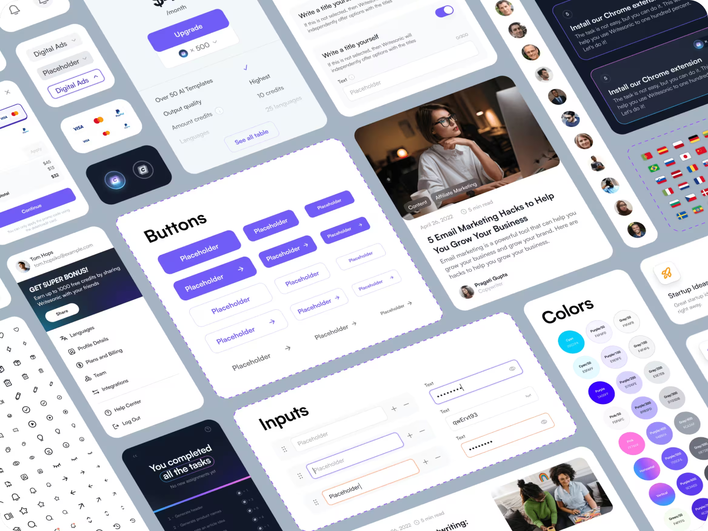
UI kit
Trigger-happy designers might get carried away by the opportunity to revamp a brand’s UI kit, or perhaps simply enticed by the extra billable hours it might bring. But expert designers know when and where to apply the tools of their trade for maximum client impact.
Around 94% of first impressions are based on your web design and 75% of a brand’s credibility relies on the UI. That said, there is no need to reinvent the wheel when refreshing a brand’s UI. It should be welcoming for new consumers, familiar to existing users, and true to the company identity.
Writesonic is a well-established company in its industry and we decided to preserve and underline its recognizable branding. Our designers developed a darker UI in a similar palette to the original design and diversified the page with 50+ unique icons. A dark theme is psychologically associated with professionalism and tech, which is used for Writesonic’s hero sections to associate the brand with AI technologies.
Intuitive navigation was developed for 60+ features. Based on our client’s wishes, it was important to explain how each feature works using interactive animations.
Now, it’s time to dive deep into UI kits and why this design aspect is essential if you want your brand to be seen as credible.
UI kit
Trigger-happy designers might get carried away by the opportunity to revamp a brand’s UI kit, or perhaps simply enticed by the extra billable hours it might bring. But expert designers know when and where to apply the tools of their trade for maximum client impact.
Around 94% of first impressions are based on your web design and 75% of a brand’s credibility relies on the UI. That said, there is no need to reinvent the wheel when refreshing a brand’s UI. It should be welcoming for new consumers, familiar to existing users, and true to the company identity.
Writesonic is a well-established company in its industry and we decided to preserve and underline its recognizable branding. Our designers developed a darker UI in a similar palette to the original design and diversified the page with 50+ unique icons. A dark theme is psychologically associated with professionalism and tech, which is used for Writesonic’s hero sections to associate the brand with AI technologies.
Intuitive navigation was developed for 60+ features. Based on our client’s wishes, it was important to explain how each feature works using interactive animations.
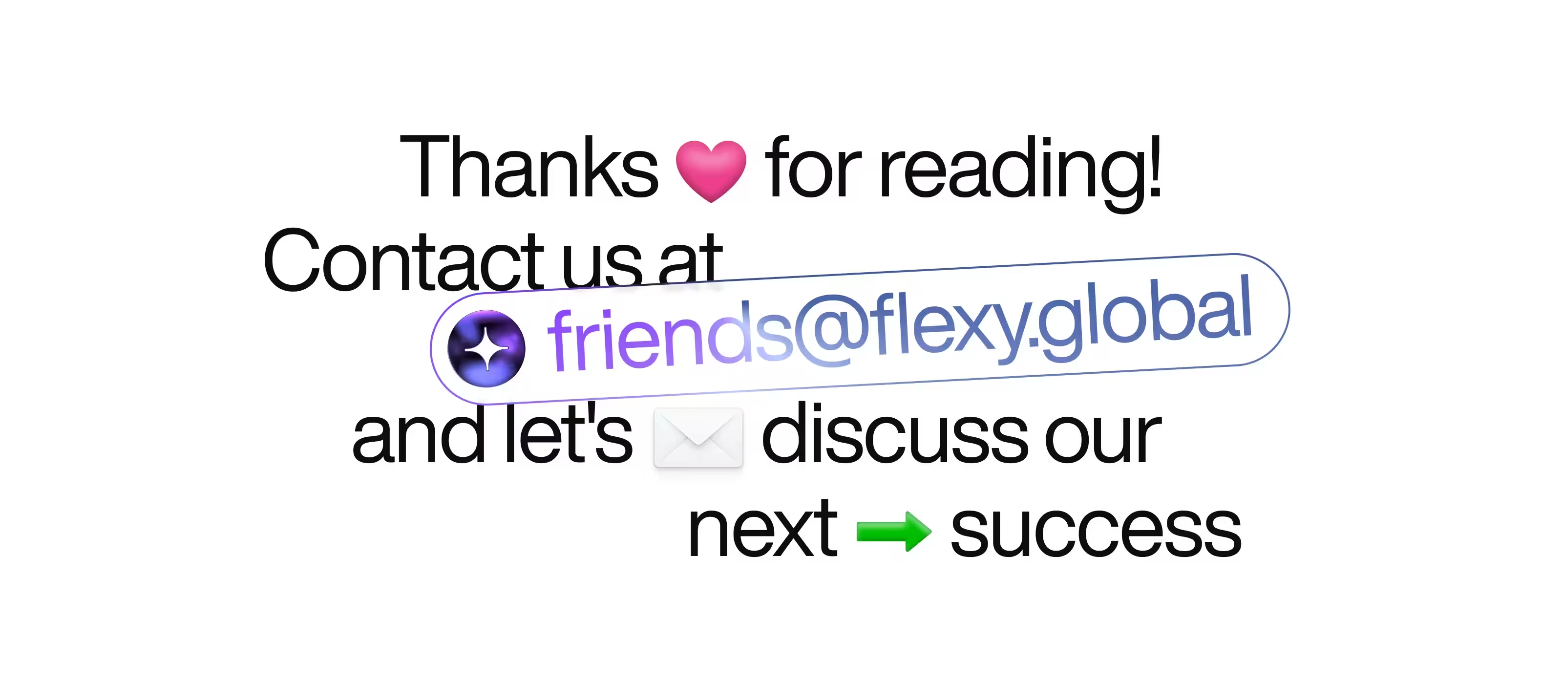
If you liked this Writesonic revamp and want a similar result for your brand or business, then you might like to work with Flexy Global.