Redesigning Workflow Automation Platform for Logistics
{{info-banner}}
Designing a Modern, Scalable Website for an AI-powered Logistics Platform
“Our goal is to become the go-to platform for logistics companies adopting AI and automation. To do that, we needed a website that clearly communicates what Reform enables today, not just what we’re building for the future.”
— Reform team
What is Reform?
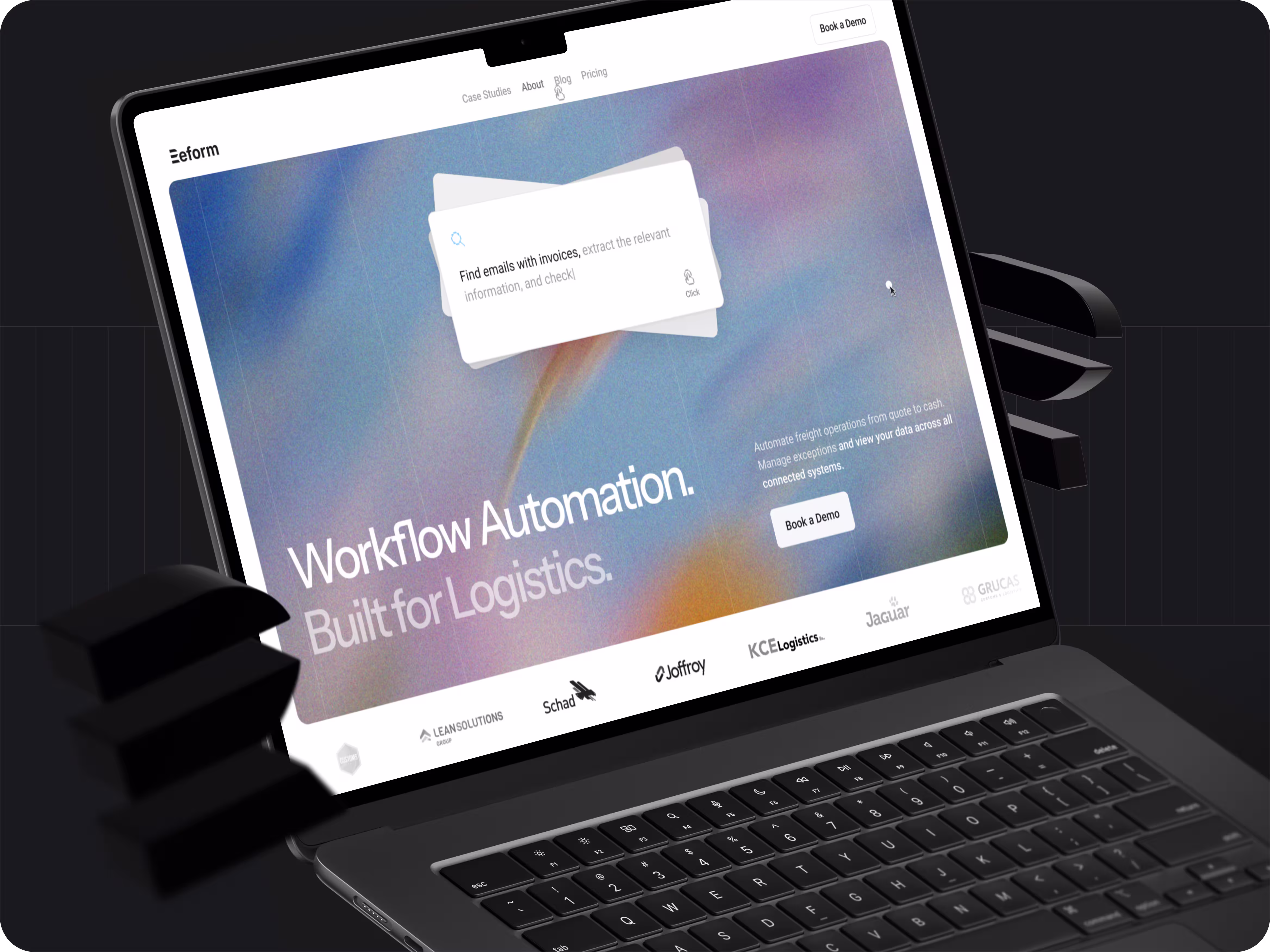
Reform is an all-in-one workflow automation platform for freight forwarding and customs brokerage companies.
Think of it as Zapier + Retool, purpose-built for logistics.
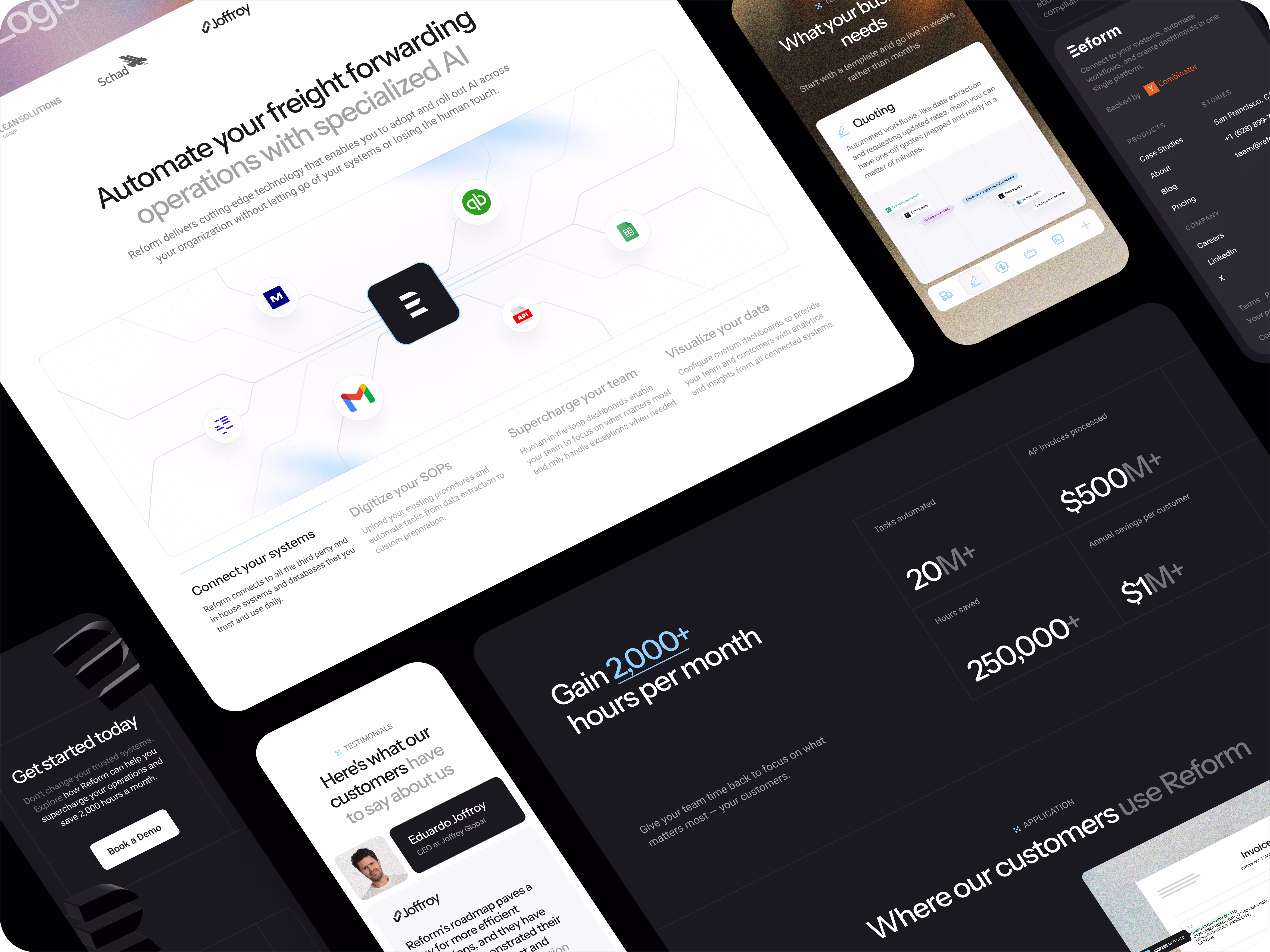
The platform allows logistics teams to connect fragmented systems such as CargoWise, Magaya, and Descartes, automate manual workflows between tools, and build both internal and customer-facing dashboards that bring data from multiple systems into one place.
Reform is designed to work out of the box, without the need for training data or predefined templates. This enables teams to move quickly, adapt workflows to their specific operations, and reduce the time it takes to see value.
By unifying systems and automating repetitive processes, Reform helps logistics teams decrease operational overhead, improve visibility across their workflows, and focus on higher-value work. The platform is used by companies looking to modernize legacy stacks, adopt AI-driven automation, and gain a competitive advantage in an increasingly complex industry.
The Challenge
This project wasn’t about inventing a new product narrative. It was about designing clarity, confidence, and credibility.
Flexy’s challenge was to:
- Visually explain a complex automation platform without overwhelming users
- Help visitors quickly understand what Reform is and who it’s for
- Reflect Reform’s modern technology through contemporary design and motion
- Build trust with mid-market and enterprise buyers in a conservative industry
- Create a scalable visual foundation for future growth
All while keeping the experience focused, elegant, and conversion-oriented.
Our Role
Flexy led the project from a design and UX perspective.
Our responsibility was to:
- Translate Reform’s capabilities into clear visual storytelling
- Design a cohesive website aligned with the product interface
- Use motion and interaction to explain workflows
- Establish a consistent visual system that could scale beyond the website
The goal was not to redesign the product but to redesign how the product is perceived, understood, and trusted.
Designing For Clarity First
One of the main issues with the old website was confusion.
Visitors struggled to understand:
- What Reform actually does beyond document processing
- How it differs from other “AI logistics” tools
- Where it fits within their existing tech stack
We addressed this through structure and hierarchy, not longer explanations.
Key design decisions included:
- Clear sectioning of concepts instead of feature dumping
- Strong visual grouping to show how systems connect
- Layouts that guide the eye and reduce cognitive load
- Rather than asking users to read more, the design helps them understand faster.
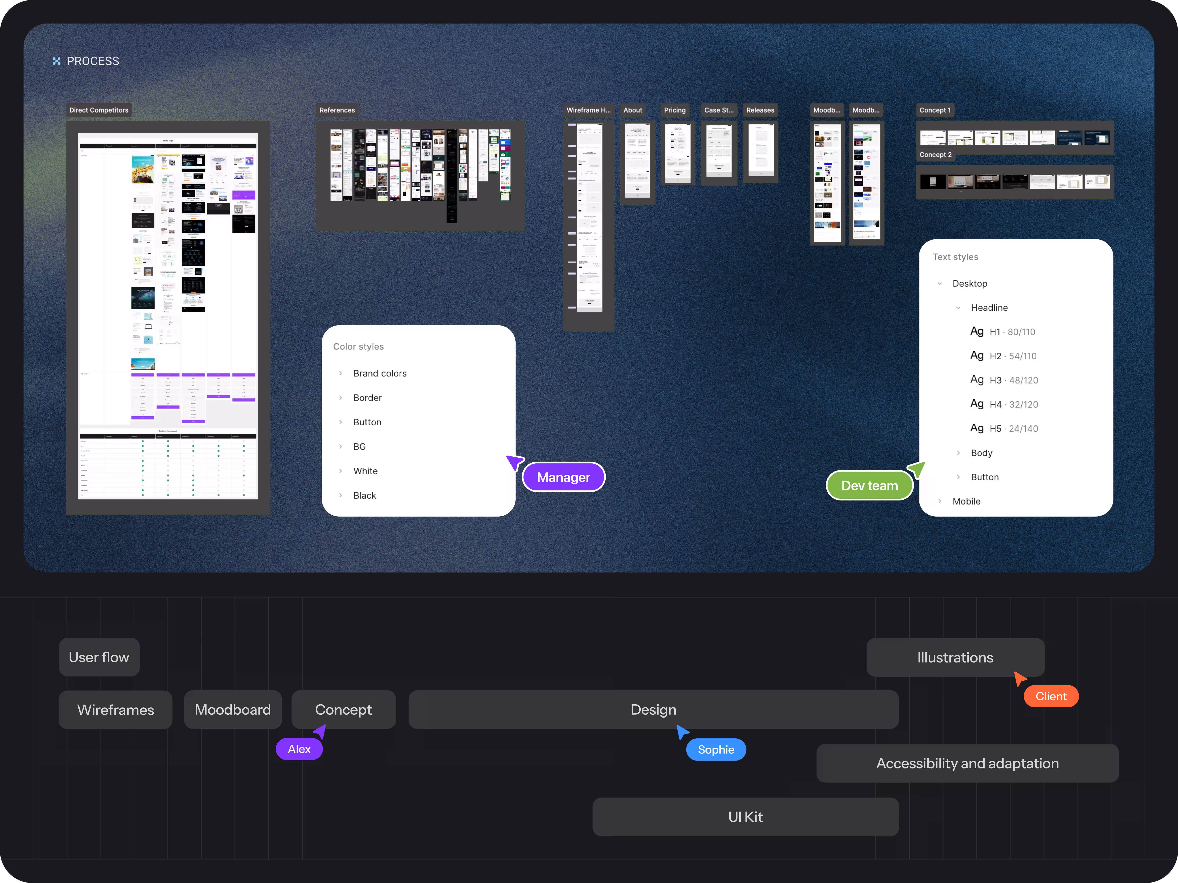
Our Approach
We treated this project as a positioning exercise, not just a visual redesign.
The goal was to help Reform’s website clearly communicate what the platform enables, who it is built for, and why it stands apart in a crowded and often confusing AI logistics landscape.
Before touching visuals, we asked:
- What should the ideal customer immediately recognize themselves in?
- What misconceptions do we need to actively correct?
- What makes Reform fundamentally different from every other “AI logistics” tool?
From there, we built the experience around clarity, confidence, and momentum.
Design decisions were guided by how quickly a visitor could form an accurate mental model of the platform. Rather than relying on feature lists or technical explanations, we focused on structure, hierarchy, and visual storytelling to show how systems connect, how workflows move, and how automation happens across tools.
Motion and animation were used deliberately to support understanding, illustrating relationships between data, systems, and actions. A custom animated explainer video was created to give visitors a concise overview of Reform’s capabilities and reduce the learning curve at first touch.
Alongside the website, we developed a consistent visual system, including custom icons and reusable UI components, to ensure the design could scale across sales materials, presentations, and future product communication.
The result is a focused, modern experience that helps Reform present its platform with clarity and confidence, while leaving room for the product to speak for itself.
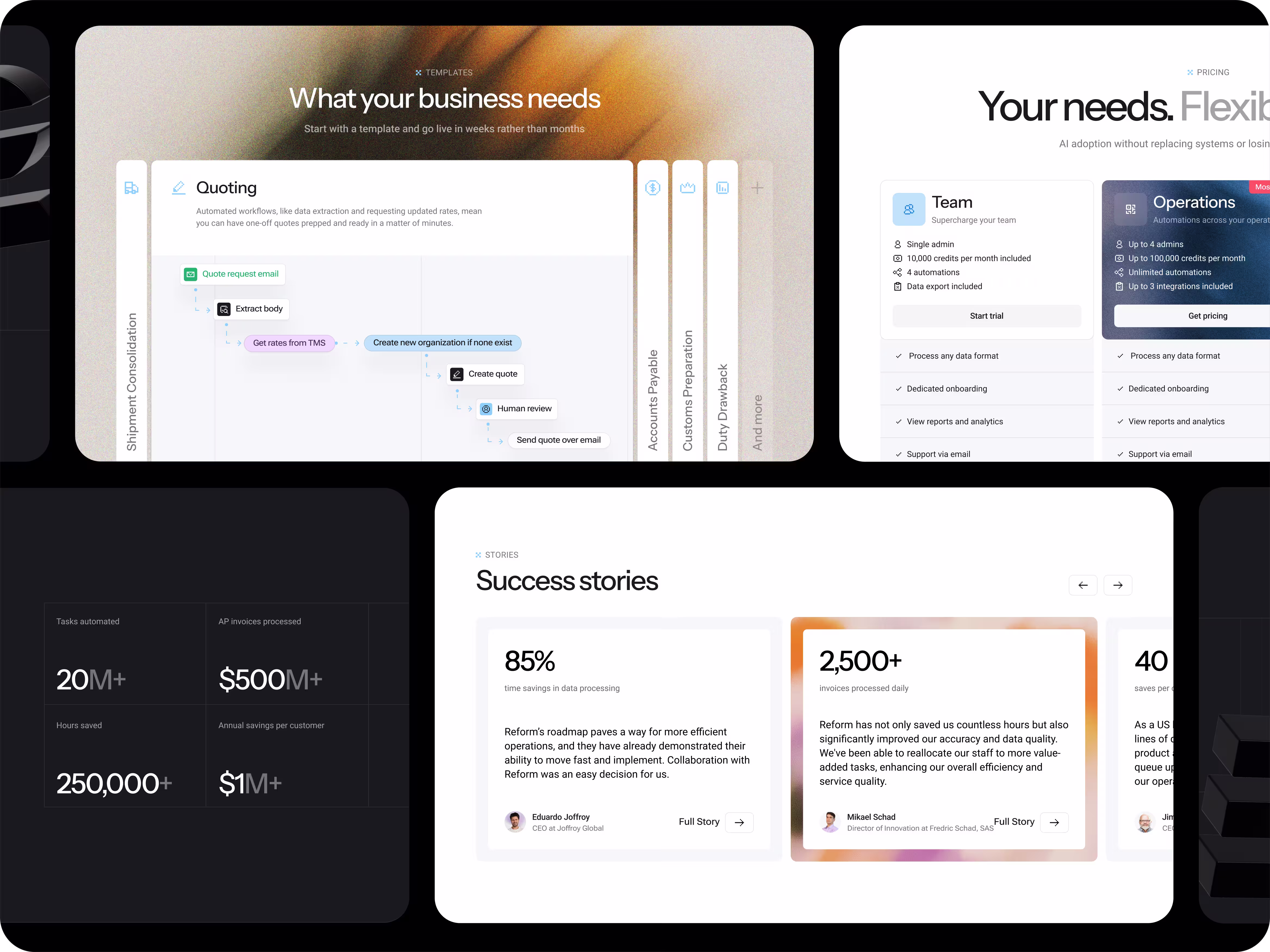
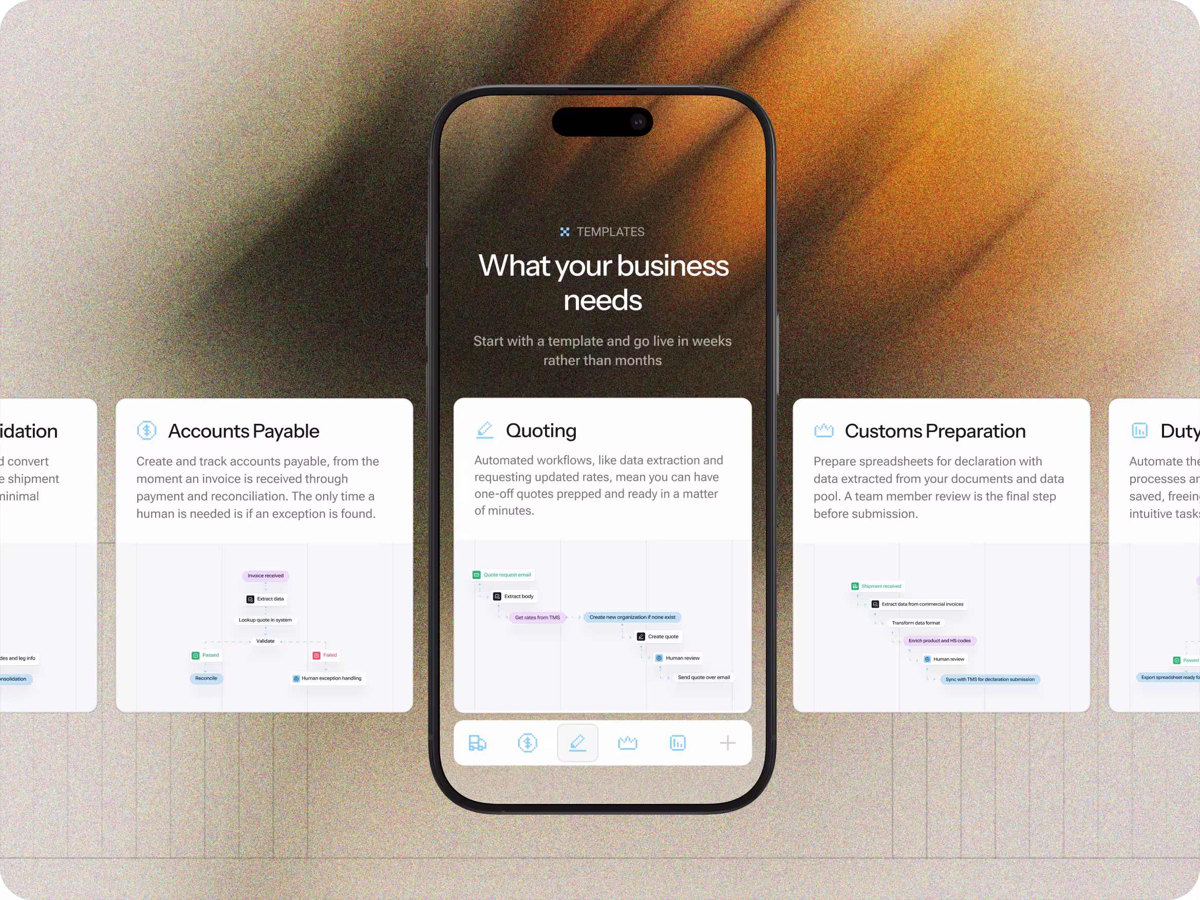
Showing the Platform, Not Just Describing It
Reform’s strength lies in its flexibility and modularity. Qualities that are notoriously hard to communicate with static text.
To solve this, we focused heavily on visual demonstration.
We designed:
- UI showcases that reflect real product workflows
- Visual representations of data moving across systems
- Screens and layouts that mirror the actual application
This allows visitors to intuitively grasp how Reform works, even before booking a demo.
Using Motion to Explain Complexity
Static layouts alone weren’t enough.
Reform’s workflows are dynamic by nature, so motion became a key storytelling tool.
Flexy:
- Designed purposeful micro-animations that explain cause-and-effect
- Used motion to show how inputs become structured outputs
- Avoided decorative animation that distracts from meaning
We also created a custom animated explainer video from scratch, built specifically to:
- Walk viewers through Reform’s core value
- Demonstrate automation flows end-to-end
- Reduce the perceived complexity of the platform
Motion here isn’t aesthetic flair. It’s a functional UX tool.

A modern Brand for a Conservative Industry
Logistics software often falls into one of two extremes:
- Outdated and utilitarian
- Overdesigned and distracting
Reform needed neither.
We aimed for a modern, restrained visual language that communicates innovation without sacrificing trust.
This included:
- Clean layouts with generous spacing
- Strong typography for authority and legibility
- Subtle gradients and depth to add dimension
- Motion used sparingly, always with intent
The result feels contemporary and confident.

Building a Scalable Visual System
Beyond the website itself, Reform needed a design foundation they could reuse across touchpoints.
Flexy delivered:
- A consistent UI kit aligned with the product interface
- A custom pixel-style icon system designed specifically for Reform
- Reusable components that work across marketing, sales, and product demos
This system ensures visual consistency as Reform continues to grow, ship features, and expand its marketing efforts.
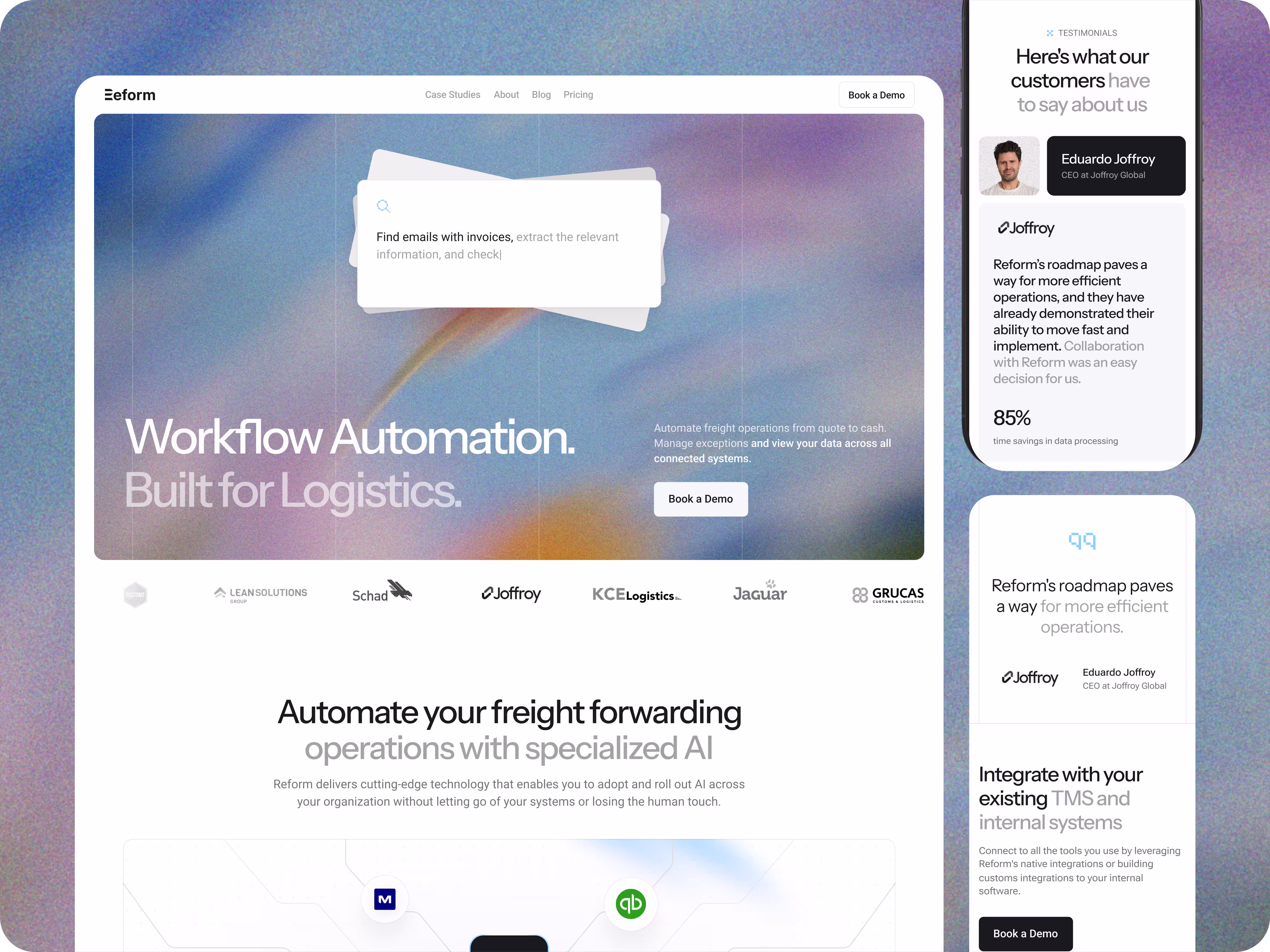
Strengthening Trust Through Design
Trust was a key objective.
Rather than relying solely on copy, we used design to:
- Highlight customer logos in a deliberate, non-intrusive way
- Present testimonials as integrated parts of the experience
- Frame metrics and outcomes clearly and credibly
Every element reinforces the same message: this is a mature, reliable platform built for serious operators.
Improving Conversion Through Confidence
The previous website struggled to convert, largely because it failed to build confidence.
The redesigned experience:
- Clarifies who Reform is for, and who it isn’t
- Shows real product depth instead of vague promises
- Leads visitors naturally toward booking a demo
Calls to action are intentionally simple and focused: see the product in action.
No pressure. No gimmicks.
The Result
A redesigned website that finally reflects the quality of Reform’s product.
The new experience:
- Visually communicates Reform’s full platform capabilities
- Aligns the brand with modern AI and SaaS standards
- Makes complex workflows easier to understand
- Establishes a strong foundation for growth, SEO, and fundraising
Most importantly, the site now feels aligned with where Reform is going, not where the logistics industry has been.
Final Thoughts
This project wasn’t about following trends or adding surface-level polish. It was about closing the gap between what Reform’s platform is capable of and how that capability is perceived at first glance.
Reform is building a powerful automation layer for logistics teams, but the previous website didn’t reflect that depth or ambition. Through structure, visual clarity, and purposeful motion, Flexy Global helped translate a complex product into an experience that feels modern, credible, and ready to grow alongside the company.
In B2B SaaS, where trust and clarity directly influence buying decisions, that alignment between product and perception matters.
If your product has outgrown its website, it may be time to rethink how it’s presented.
Let’s talk.
Book a meeting