A Complete UX and Structure Overhaul for One Tribe
{{info-banner}}
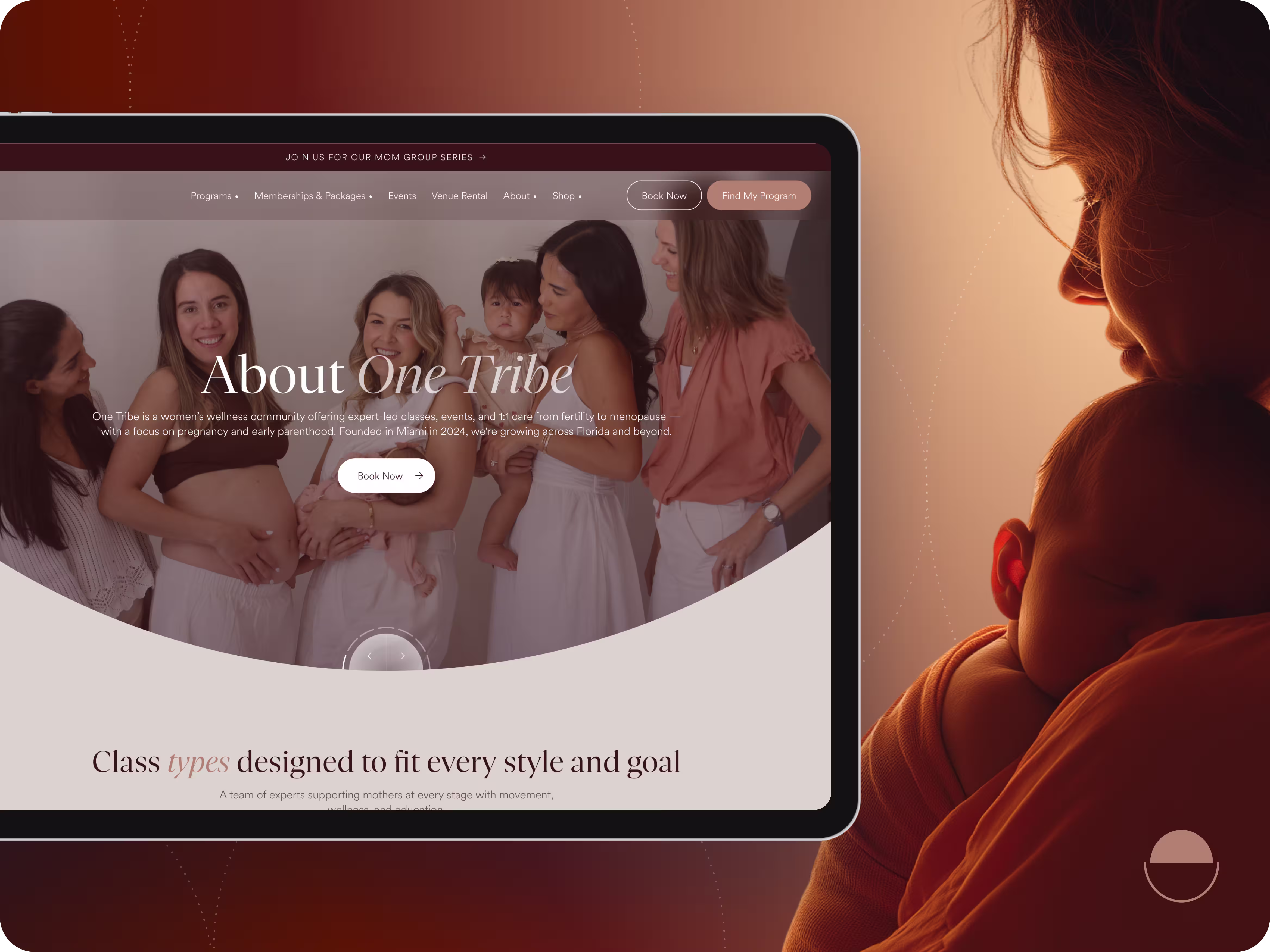
One Tribe is a Miami-based wellness community supporting women with expert classes, events, and personalized care through fertility, pregnancy, postpartum, and menopause.
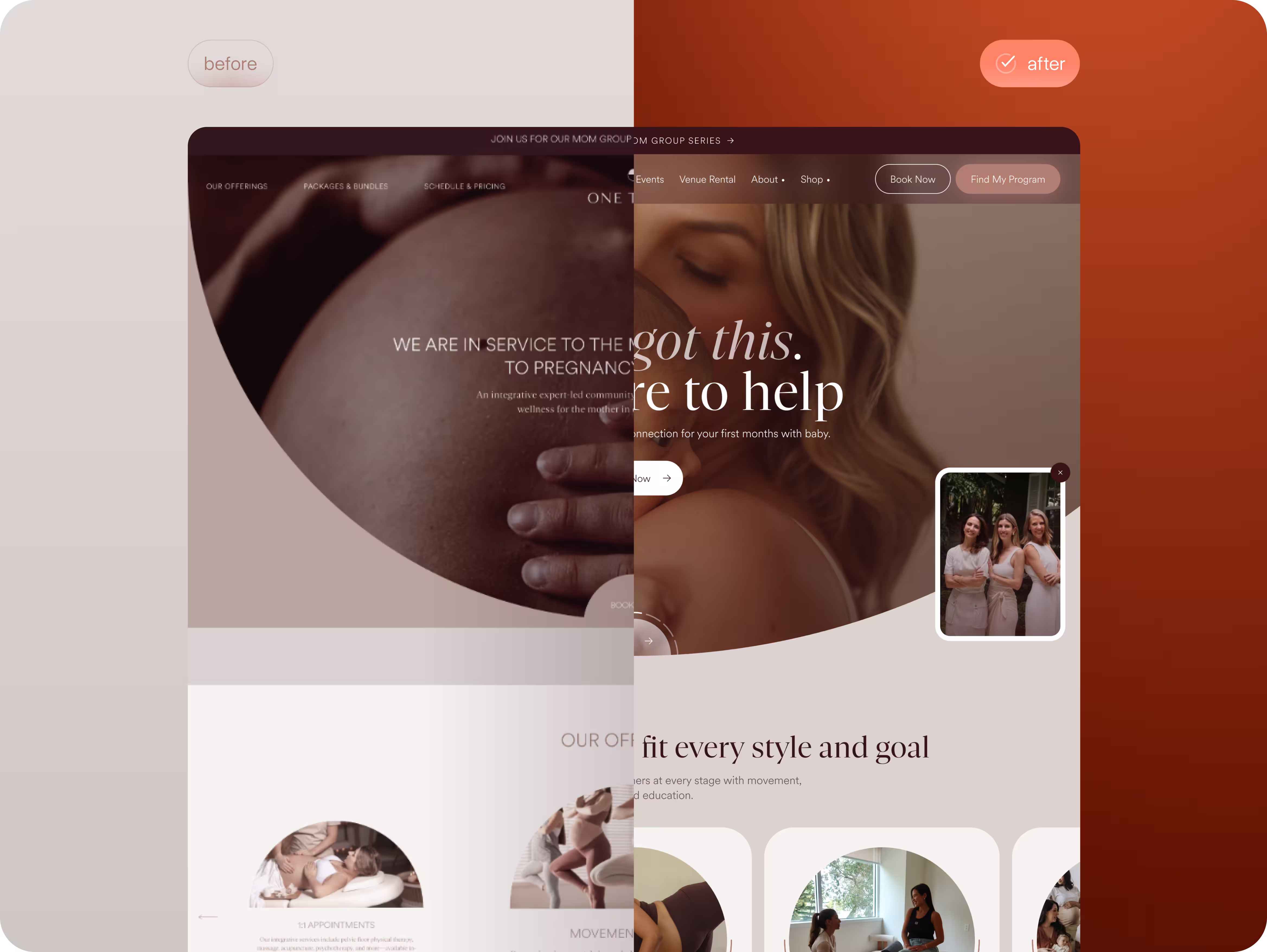
Flexy redesigned their website as a calm and intuitive entry point into this care ecosystem, built around clear storytelling, quick booking, and a “find my program” flow that guides each woman to the support she needs.
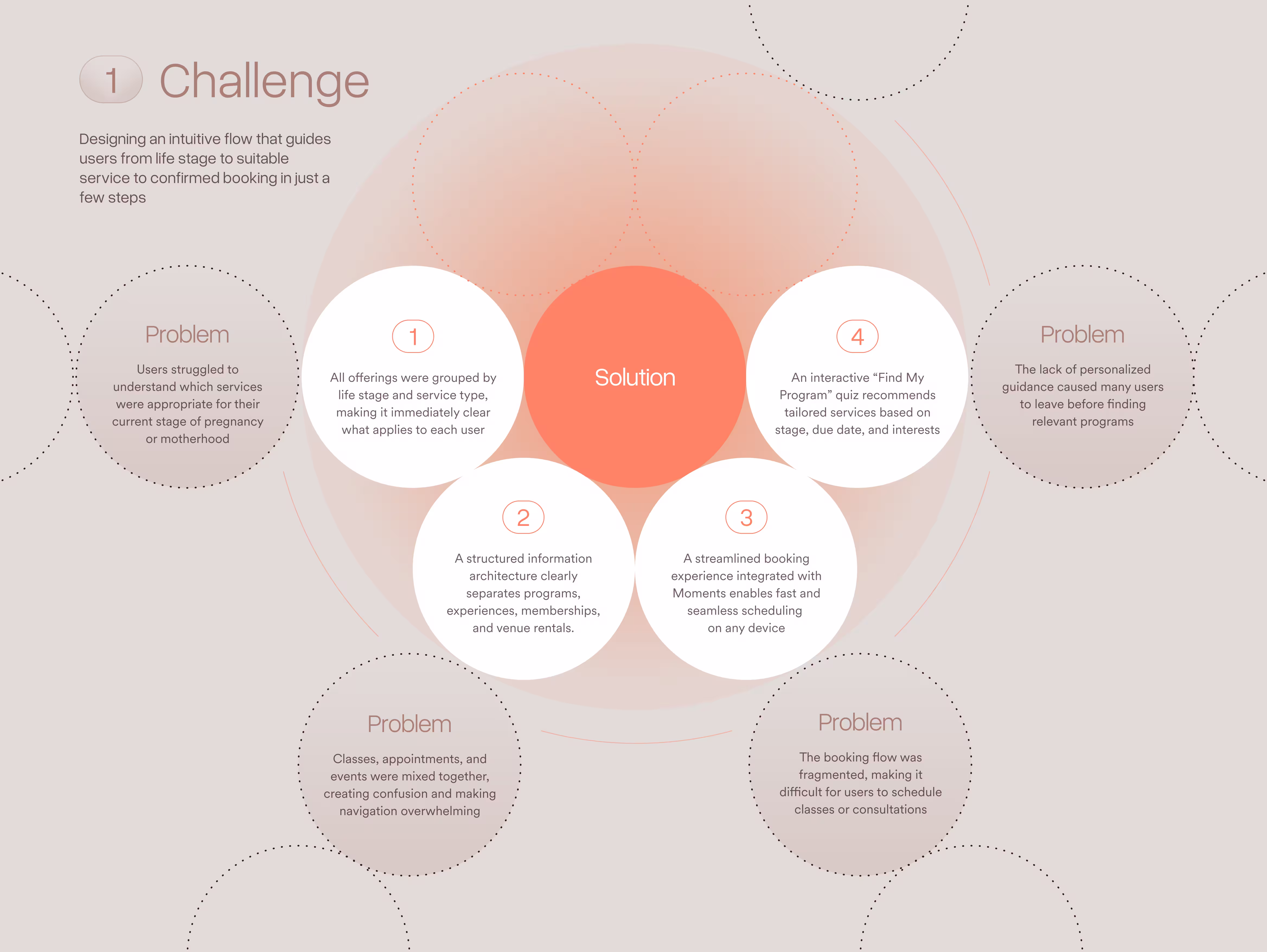
Problem
Users struggled to navigate One Tribe’s complex service ecosystem. They couldn’t easily tell which offerings matched their life stage, classes and events were mixed together, the booking flow was fragmented, and there was no personalized guidance to help them choose the right support. These issues created confusion and drop-offs when trying to book services.
Solution
We redesigned the experience to feel clearer and more guided from the start. Services are organized by life stage, content is easier to navigate, booking flows smoothly through Moments, and users get personalized recommendations through the “Find My Program” quiz. The result is a simple, intuitive journey that helps users understand where they are, find what fits, and book their next step easily.
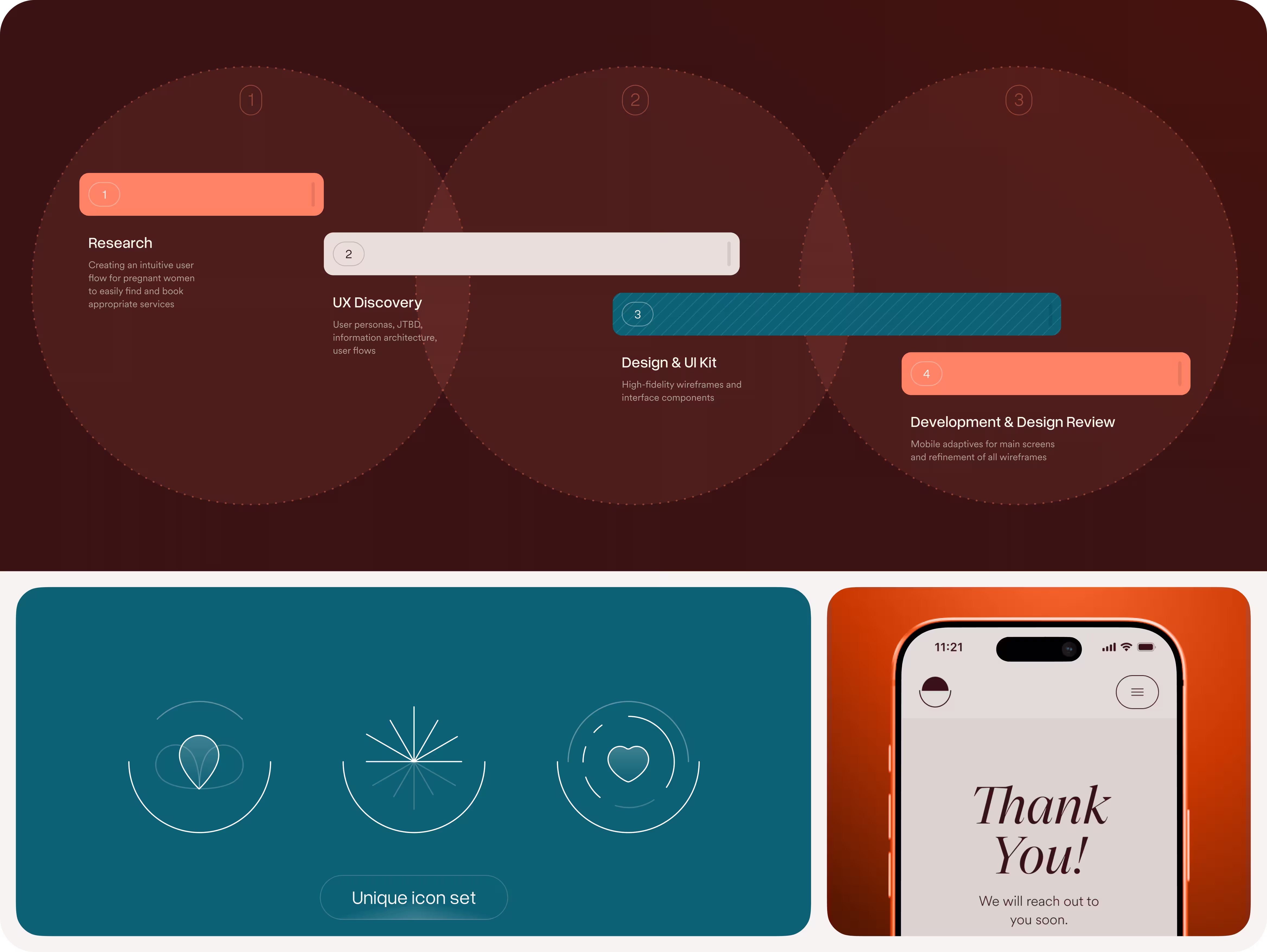
We followed a four-step flow: research, UX Discovery, design, and development. Each phase built on the last, helping us understand users, shape the structure, design the experience, and bring it all to life with responsive and refined screens.
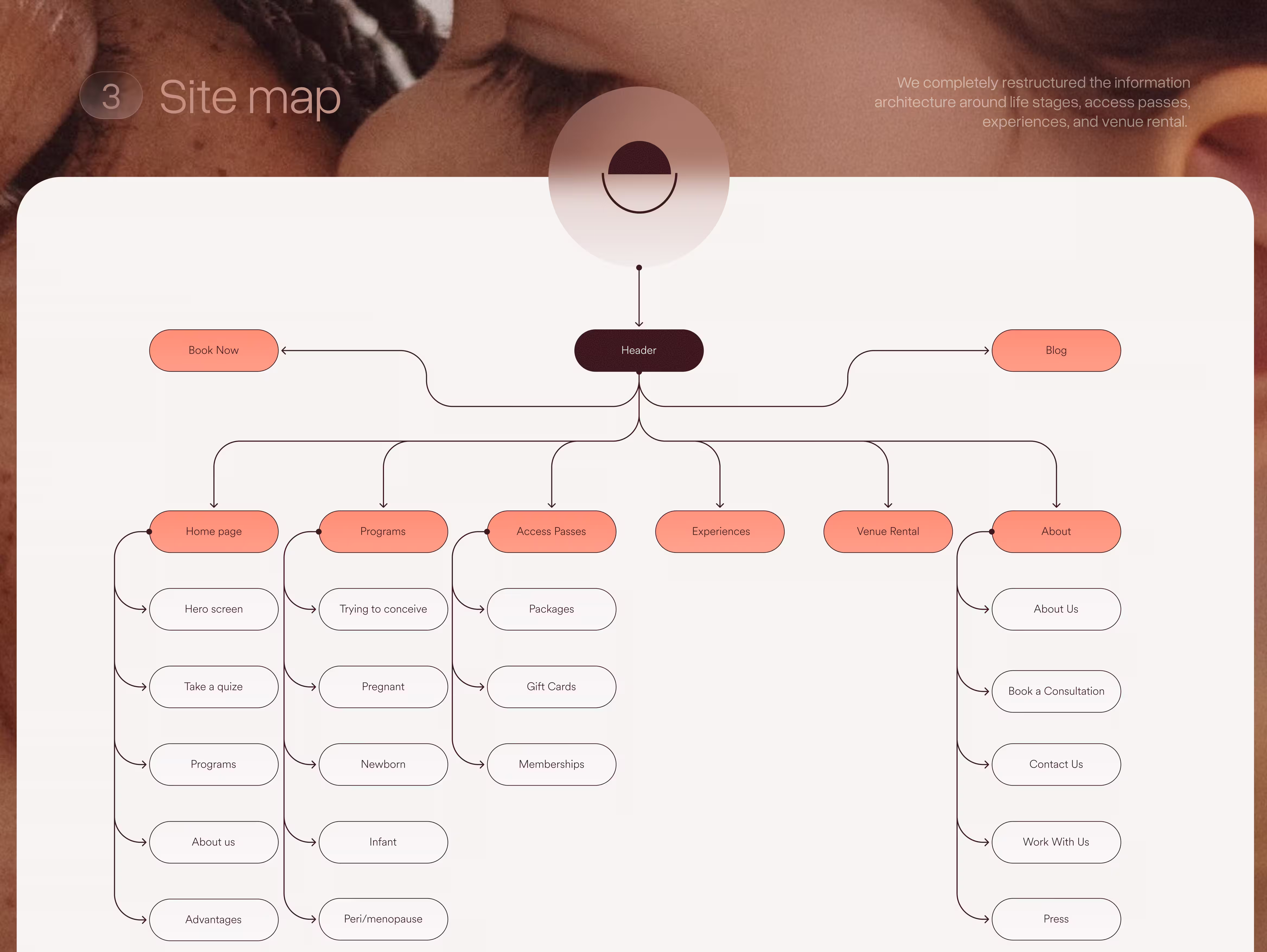
To simplify navigation, we rebuilt the entire sitemap. The new version organizes everything around life stages, access passes, experiences, and venue rental, with clear pathways from the header down to individual pages. This structure gives the client a scalable foundation and gives users a far more intuitive way to explore the full range of services.

Before designing the interface, we laid everything out in wireframes. With such a large ecosystem of services, wireframes were essential for testing how all the pieces fit and worked together. This helped us refine navigation and simplify decision points to ensure the final site would feel easy to move through.
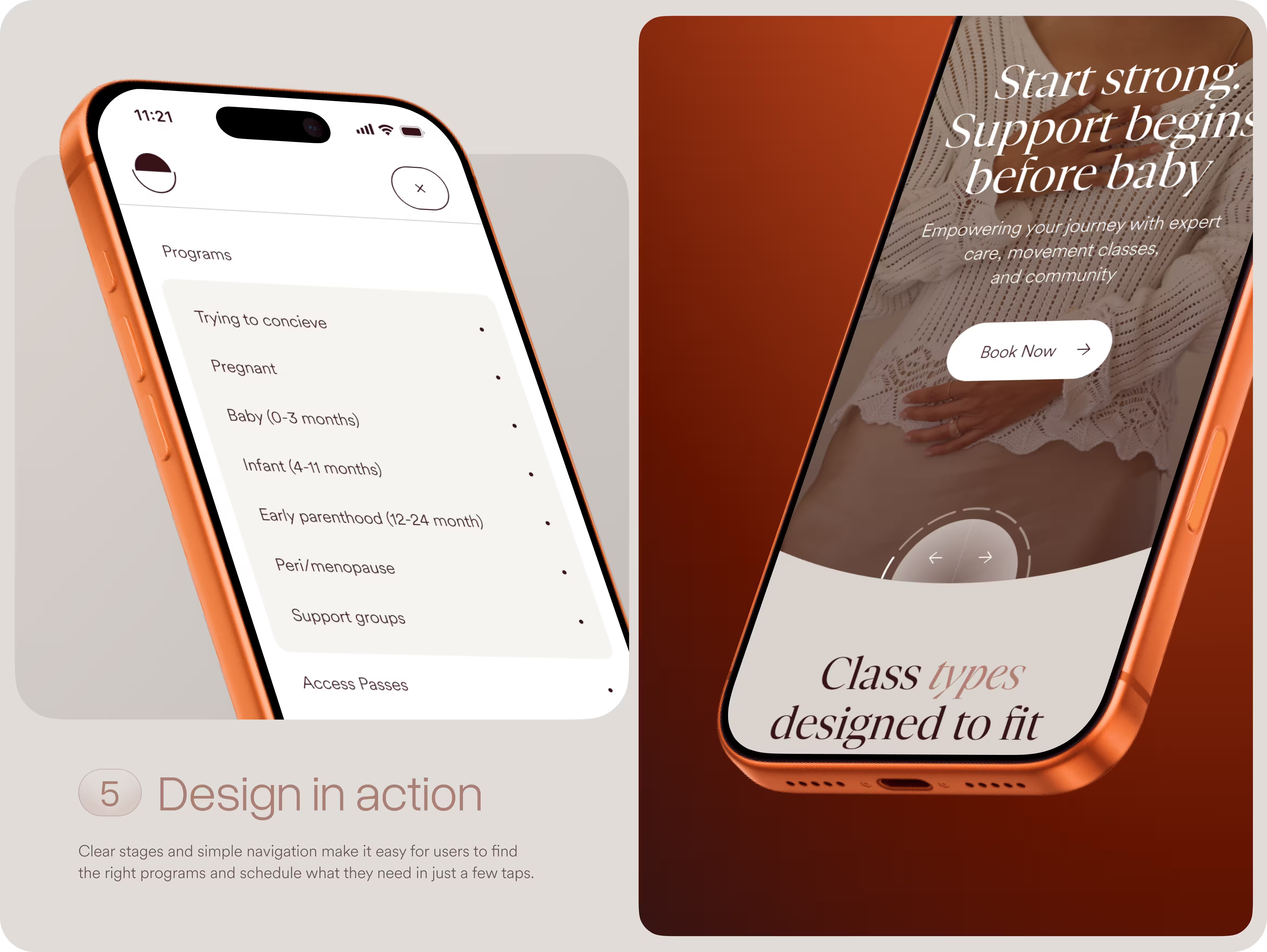
We shaped every interaction to feel effortless. Whether a user is exploring programs or checking class types, the design removes confusion and keeps the next step obvious and easy to follow.

We designed package and membership pages that bundle services into clear, story-driven offers like “Prepping for Pregnancy,” “Mama in the Making,” and “4th Trimester.” Each one highlights benefits, pricing, and next steps so users can compare options.

The programs overview page showcases each stage of a woman's journey with dedicated classes, 1:1 support, and upcoming events. We combined emotive imagery with structured cards and clear schedules to make it easy to explore, filter, and book in a single flow.
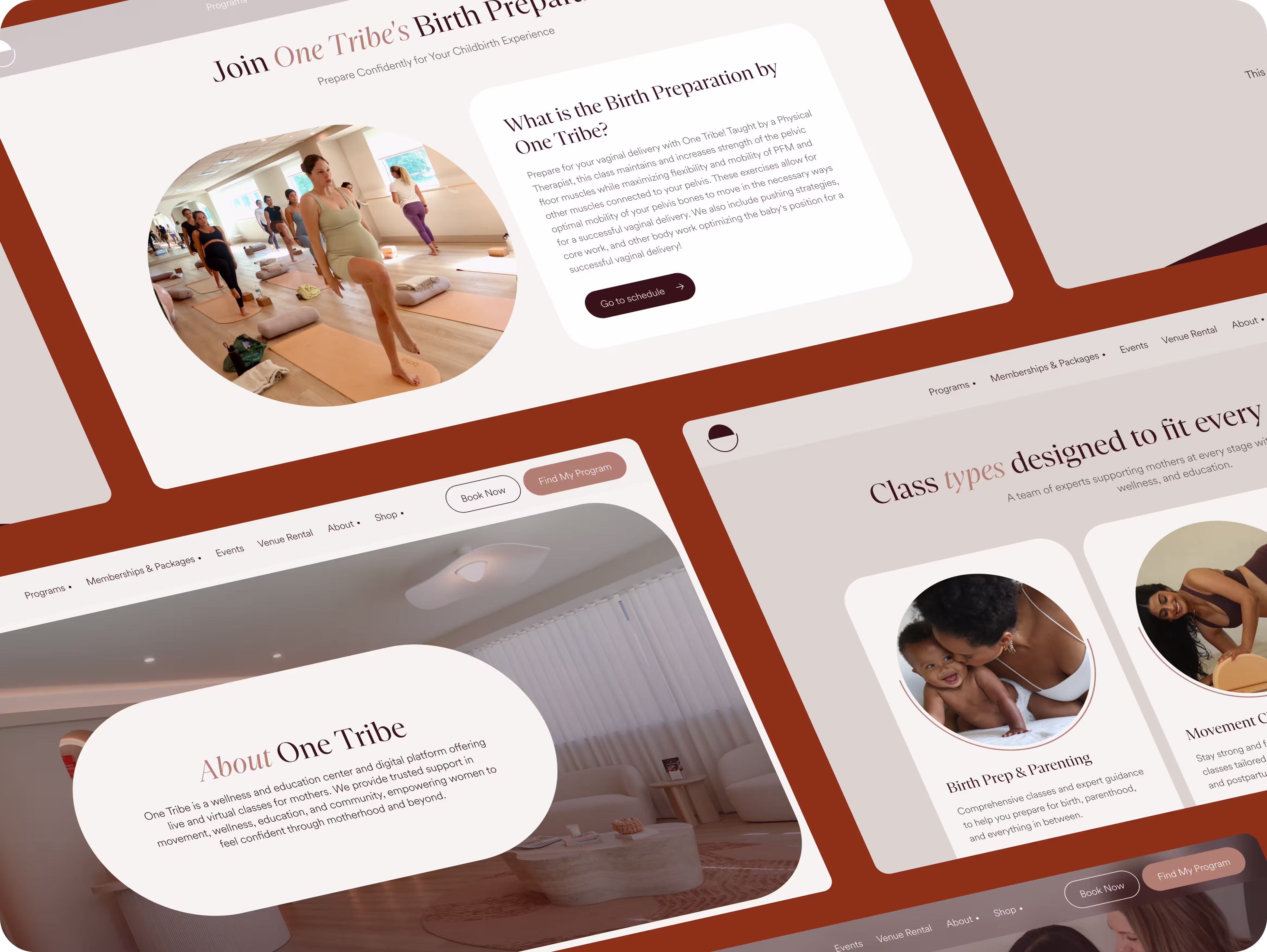
Across the site, we built a cohesive system of layouts that balances warm photography with clean UI components. We kept One Tribe’s original style and color palette, enhancing the design with clearer visuals and a more polished feel. This modular approach keeps the experience consistent from education pages to event listings.
The site runs on Webflow and CMS, paired with a custom Moments integration for service links, quiz data, and trimester filtering. Our developers also built the logic behind the scenes, calculating due dates, identifying trimesters, and matching users with the right services.
The project spanned 466 hours and dozens of screens, and included building a completely new structure and logic from scratch. The result is a site that reflects the full breadth of the client’s offering and gives them room to grow. Their feedback was incredibly positive: they loved both the quality of the experience and how collaborative the process felt.
At Flexy, we specialize in complex projects that require creating logic, flows, and intuitive user journeys from the ground up. If you’re navigating a similar challenge, our team is ready to help.
Contact us, and let’s start exploring your idea.