Vicious Curl - Design that boosted sales by 60%
“I was really happy with how fast they worked on the designs; the project was completed very quickly. It's also very convenient that they always offer the best solutions and easily make any changes and additions. The end result is excellent. Advertising has already begun to pay off.”
-Maksim Kvitsinskii, Head of Marketing at Vicious Curl
The real pickle when running an e-commerce website is finding the right balance between practicality and aesthetics.
According to Think with Google, 85% of shoppers say that product information and pictures are important when deciding to buy from a brand. At the same time, a brand’s identity and uniqueness are growing in importance in 2023. Around 59% of consumers prefer browsing ‘beautiful and well-designed websites rather than basic ones.
Both factors – usability and aesthetics – are important for extending user session length and prompting conversion, but what is the golden ratio?
Vicious Curl, a hair care brand specializing in curly hair types reached out to Flexy Global to help them find the right balance and redesign their website.
Let’s walk through the project and find out how our designers united brand image with practicality.
What is Vicious Curl?
The brand offers cruelty-free hair care products for all curly hair types from 3S to 4C. The company was founded on 30 years of experience in the hair care industry and aims to provide high-performing products via its e-shop.
Our challenge
Flexy was tasked to redesign VC’s (don't confuse it with Venture Capital) landing pages, provide templates, and make the user flow as silky smooth as the brand’s hair conditioner. The biggest challenge was that the brand had a fairly small product line and we had to find a way to display the catalog and bundles convincingly.
The scope:
Landing redesign, product cards, product catalogs, a personal recommendation quiz, blog, article templates, and a store map.
Flexy’s redesign sparked organic sales even without ads being used, growth that the company did not see happen before!
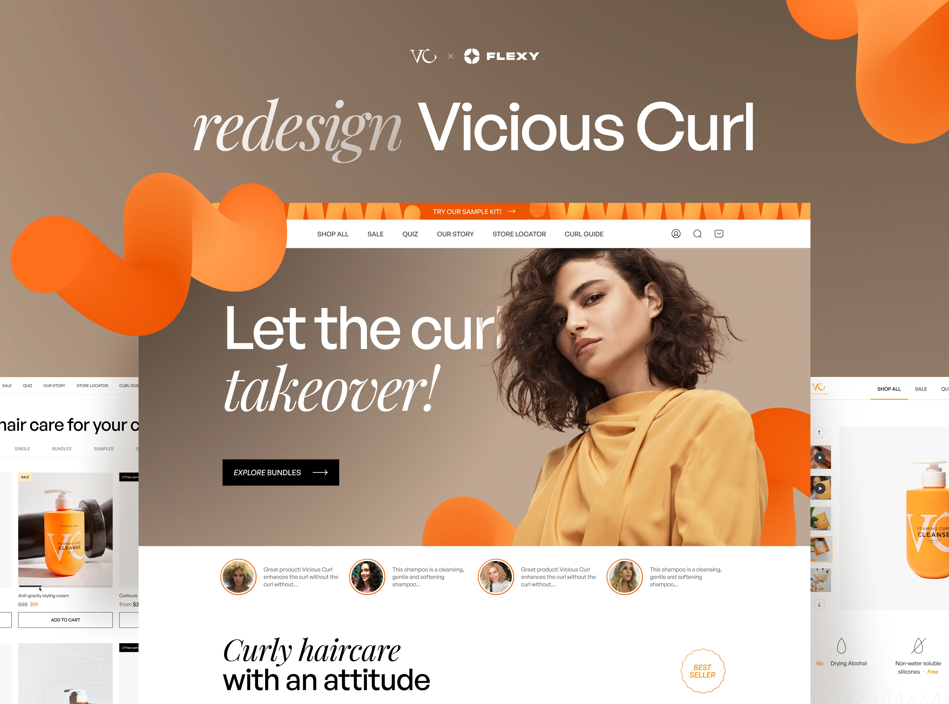
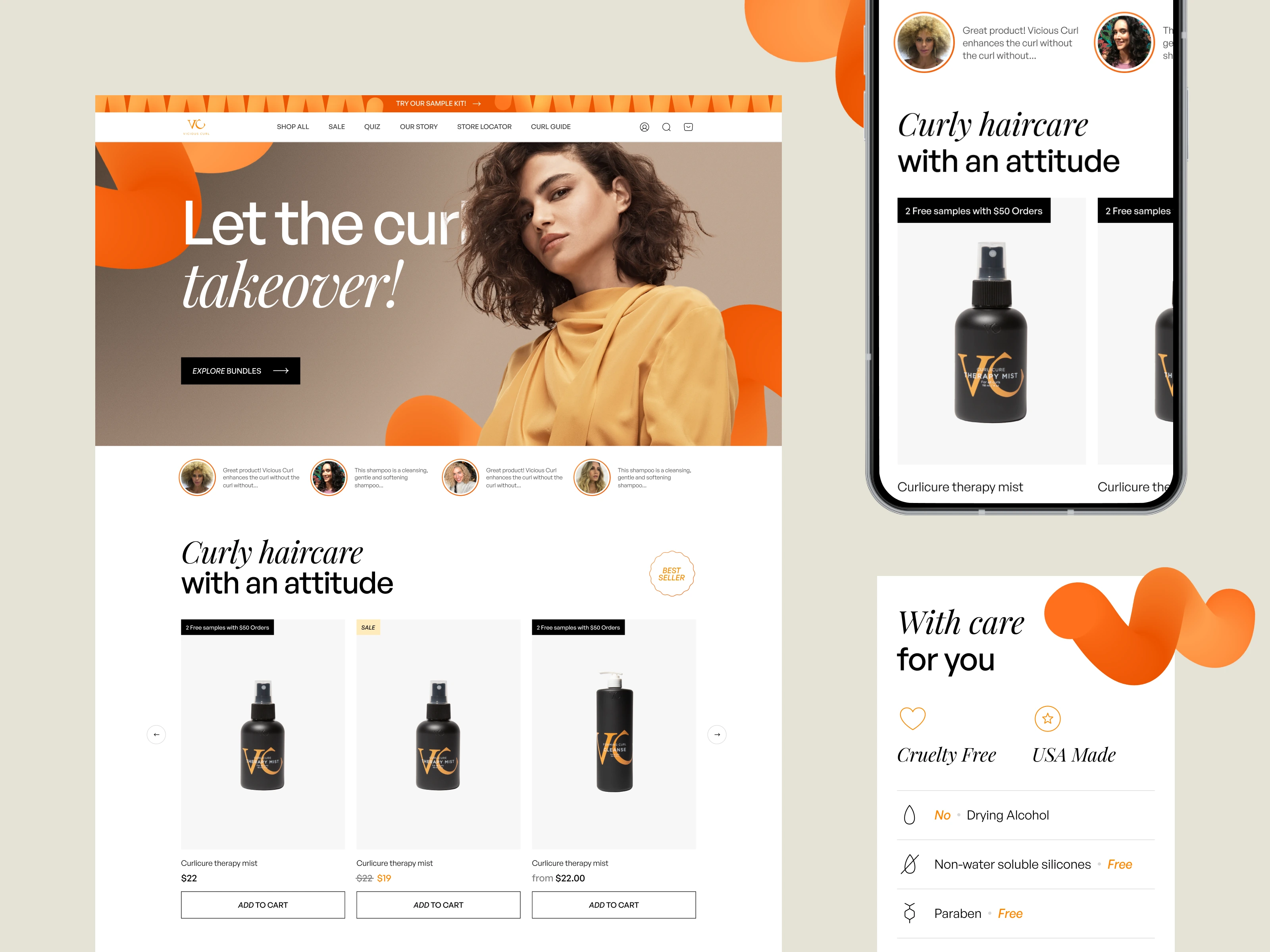
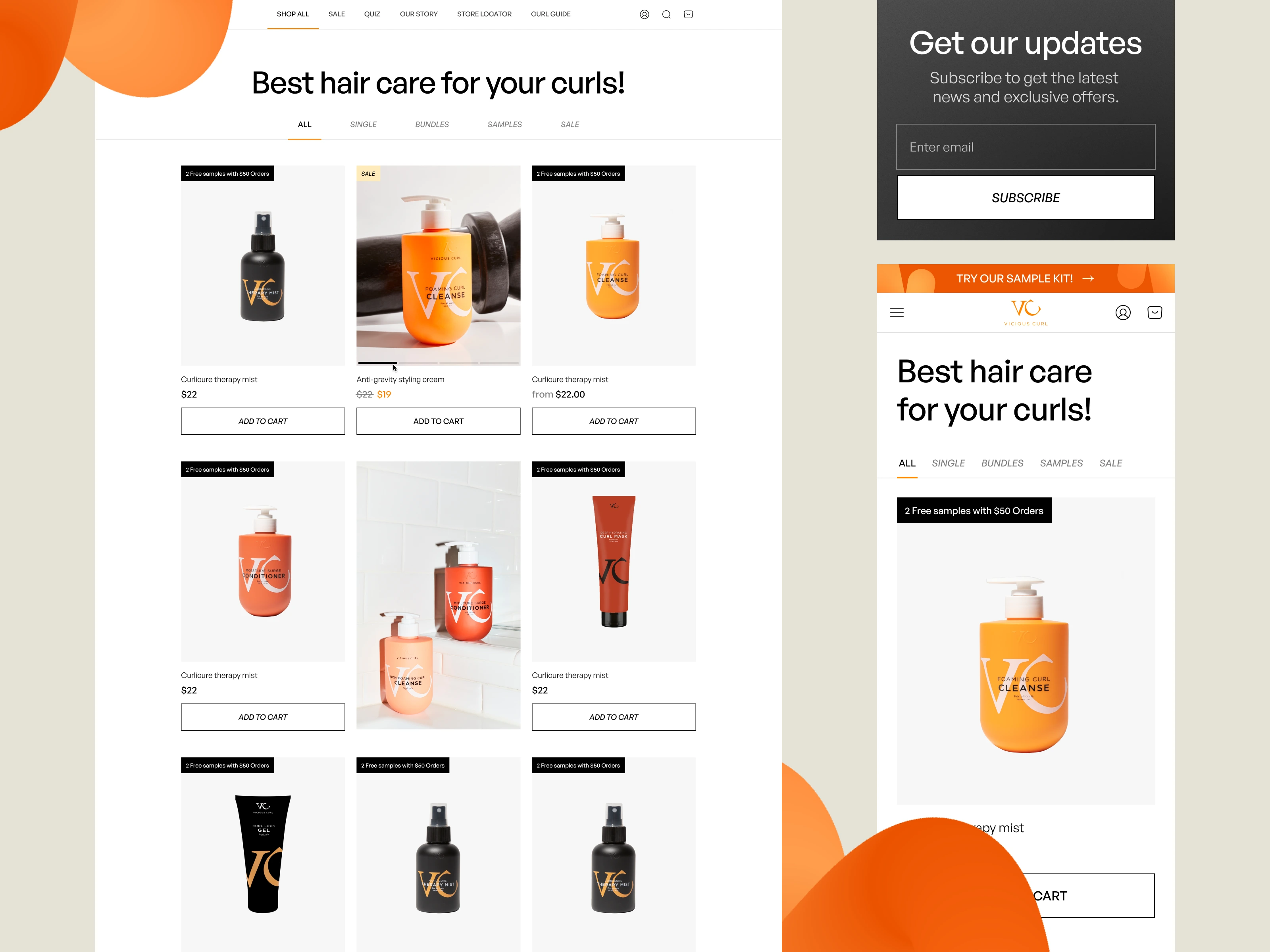
Make your brand values clear on your homepage
One of the fundamental indicators of brand professionalism and trustworthiness is attention to what customers want. And what they want first and foremost is to use a functional website.
The new landing page has all the familiar e-commerce elements typical of an online store like ‘Shop All’ and ‘Sale’ so users know exactly where to find what they are looking for. The home page reveals VC’s product advantages and resolves user queries, making sure users can immediately proceed to make purchases.
We made sure that the brand’s best offers are instantly accessible by using intuitive navigation throughout the site’s main pages. Easy navigation is thoroughly developed during the wireframe building stage to make sure the UX is fluid and simple as all genius things are. It was found that 60% of users believe usability is the most important web design characteristic when online shopping. Focusing on usability can reduce churn and increase customer retention.
“Churn rate in e-commerce is the number of consumers that cancel subscriptions or stop buying from a company.”
Flexy designers went on to strengthen VC’s corporate identity by dividing the website into sections that emphasize the company’s values. The most important sections that displayed the brand identity were social proof examples and product benefits.
At the top, we implemented a block with consumer stories where the brand can directly highlight live customer reviews. Further down the homepage, we wanted to show that our client has an active social media community and partners with influencers on TikTok and Instagram. We used a multimedia approach as a Call To Action and social proof to encourage newcomers to join the curly community. While this adds to familiarity in the UX, it also shares the brand advantages and the connection the brand has with its customers.
The original website already had a product benefit section, but it was placed at the end of the landing page. We repositioned it towards the top half of the homepage and modernized the icons, leaving a universal block that can be reused on different site pages.
Another major change we made was reducing distracting imagery and creating a spacious UI. As we mentioned earlier, the greatest challenge in this project was coming up with a convincing, aesthetic, and engaging design with limited specialized products to display.
Vicious Curl came to us with a bold, bright, and tightly packed web design, which left users feeling like there was no room to move around. Around 84.6% of web designers agree that developing crowded web designs is the most common mistake. There is no shame in using medium-sized images and leaving some negative space for the eye to focus on the really important things, like product descriptions.
The mobile-adapted UI/UX design retains all the functionality of the desktop site and the layout allows you to explore content and engage with products regardless of the device used.
Read on to find out UX tips on how (good) product pages are designed.
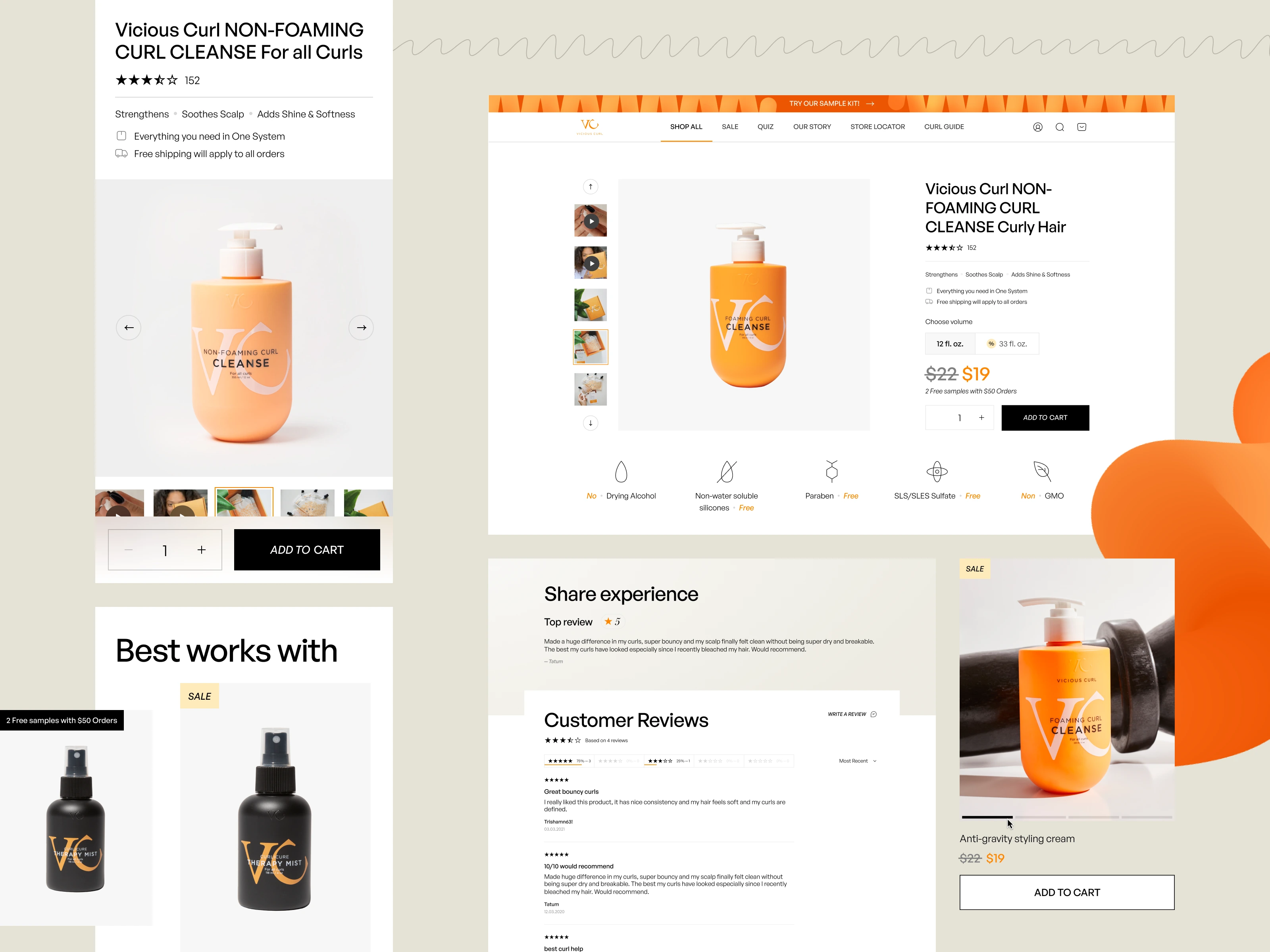
Reassure the customer through your product page
Most customers enter a product page with a lot of questions. “What is the product for?” “How does it work?” “What does it look like?” “What do the results look like?” “What are the sizes?” “Why should I buy it?”
These are just a sample, but try to understand the user’s worries and answer their unvoiced questions with design.
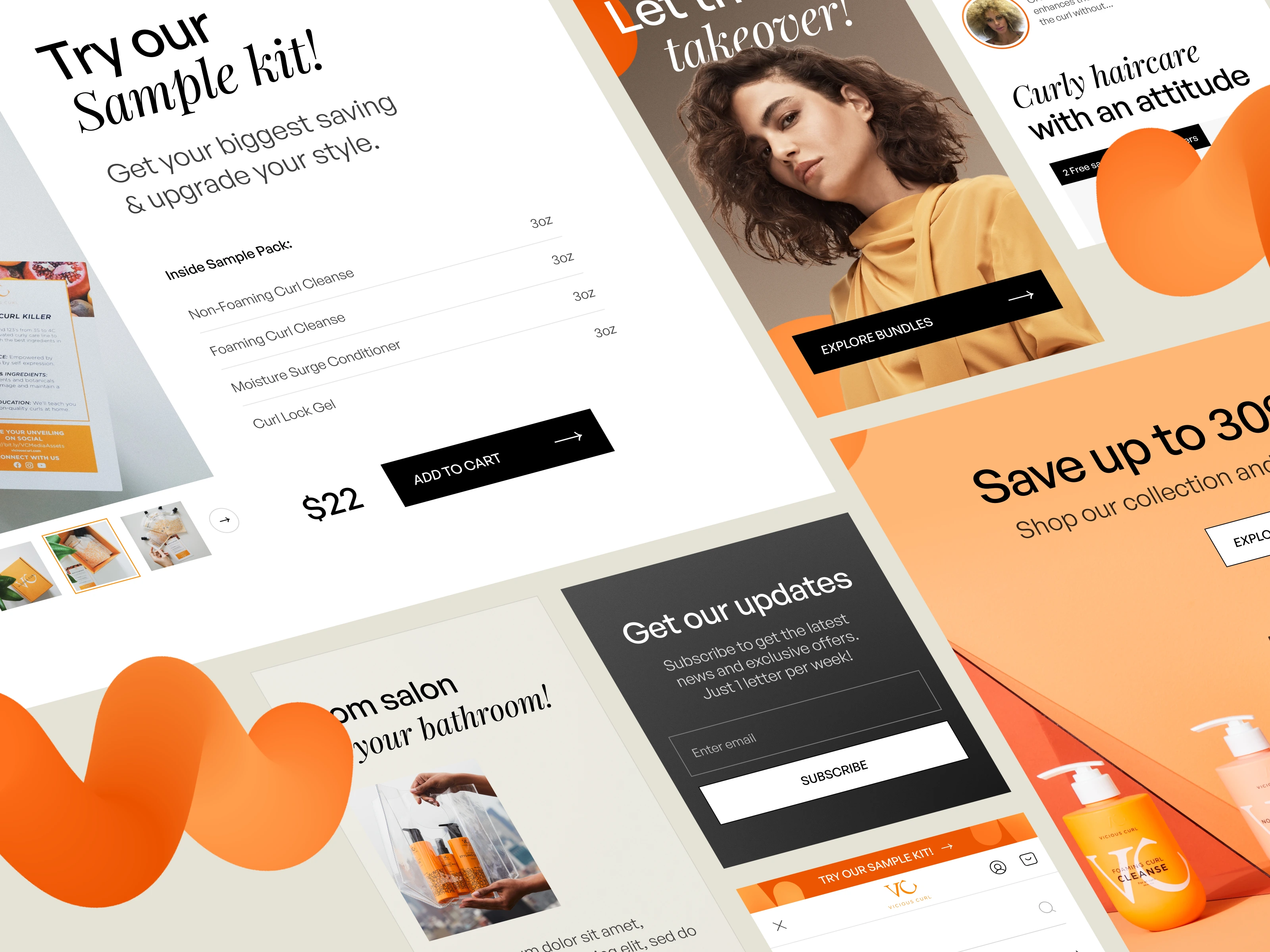
Are they worried about the quality? Reassure them with a star rating and customer reviews. Vicious Curl went beyond promises of quality and even sends free samples with offers over $50, which effectively promotes interest and trust.
Are they doubting if it is the right product for them? Show the effect the product has on a customer, as we have done for VC by including photos of different curl types.
Influence customers and don’t just sell. Insight studies show that 77% of shoppers would like to see other customers’ photos rather than stock photos or photoshoots before making a purchase decision. Take note — video and text help prompt users to buy.
The mobile version of our redesign is just as transparent and easy to use. The ‘Add to cart’ button is fixed and moves while users scroll so they can always repeat the action quickly no matter what part of the page they are on.
But how can a customer find the ‘right’ product quicker? We will talk about that next.
Learn more about your user using quizzes
Together with the VC team, Flexy designers developed an interactive product recommendation quiz. It is an engaging and interactive addition where users can answer a few questions and receive relevant product listings, which can be immediately added to the basket, along with personalized recommendations for curl care.
Recommendations may cut session length because users will instantly find products that suit their needs, but they will also spike the conversion rate and sales. A study found that 30% of customers leave the website if they don’t find what they are looking for. Remember, a website that makes the shopping experience pleasant and quick will have people wanting to return for more.
Next, we talk about the importance of page layouts and how we took VC’s user experience to the next level.

Make your blogs & articles accessible
The original blog page had a vertical structure with one article below another, lending too much space for each news piece. While it’s true that we tend to read things more on the left-hand side of the screen, human vision is narrow and wide. Hence the wide projector screens in cinemas.
The best way to present a sequence of information is by displaying it as a bundle. It was found that users spend 81% of their time viewing the first 3 screenfuls of information, so what’s the point of making a very long list? We applied this research knowledge, as we always do, and made a convenient blog page with easily customizable templates for articles.
Flexy also provided product card blocks that can be embedded in the articles and help customers view the hair care products without having to leave the page.
Read on to find out which UX elements increase conversion.

A catalog should not overwhelm users
As you now know, users spend more time looking at the first 3 sections of a page, so there is no need to add unnecessary information. Vicious Curl’s new catalog page design is not too different from the original, but the detailed changes matter. The new page consists of a simple grid with products, which we diluted with banners and call-to-action cards.
The main change was in the catalog filters. Flexy designers recognized that users would simply miss the filters if they are in a hidden drop-down list, so they unveiled the options and fixed them at the top of the page, easily accessible. This design decision also leaves a feeling that there are many more products on offer. This feeling was also reinforced by using smaller product blocks and pagination.
Directional cues such as CTA buttons are now less distracting so that they would act as a prompt rather than the focus. Studies found that users tend to browse e-shops on their mobile devices. For that reason, Flexy made sure that the design has fixed navigation. For example, the filter options in the mobile version do not take up much space and help the user filter the entire catalog without having to scroll back up.
So here is a question, what if the user prefers to make purchases at a brick-and-mortar store, otherwise referred to as “offline?” Vicious Curl implemented the perfect solution with our designer touch.
Be transparent, visualize your store location
The site now has a special page where you can find the nearest store with Wish's Curl products. We developed an interactive map where you can use a search bar and a set of basic filters to find the desired store — the UX is swift and effortless.
Most importantly, the map card functions just as well on mobile devices and is convenient to use on the move.
There you have it, Flexy Global’s adaptive redesign across multiple landing pages. The factor that makes this design appropriate for Vicious Curl is the UI, of course.

Our vitamin C-induced UI kit
While developing the re-design, we made a simple and convenient UI Kit, which helps speedily assemble new pages and maintain a unified style. What brings a design together are fluid devices.
“Fluid devices are elements of imagery, style, or text that are used recurringly throughout a company’s branding, which leads to them becoming a symbol of the brand identity.”
Some examples of fluid devices used in this project are color application, design elements, and font combinations.
The majority of the brand’s original color palette made it into our new design, we just made it even more citrusy and saturated to suit the brand's purpose. Drawing ideas from the hair care products themselves, we enriched the design with color and made it look full of volume and smooth as a curl.
The different hair and curl types that the brand is helping to nurture and control inspired Flexy designers with ideas for curled design elements that you can see throughout the landing pages.
We also used a combination of fonts to suit the brand image and goals. A prime example of this is the homepage banner where a rigid sans serif font is replaced by a curvy serif exclamation, highlighting that the point of Vicious Curl is to empower natural beauty and set curls free.
Thank you for reading about our redesign project for Vicious Curl! Did you like our design choices and enjoy the tips we shared?
Contact us about your project ideas!