Designing for Impact: GenocideEdu’s change-inducing interface
“Would give 1,000 stars if I could. Flexy Global is simply, above any other agency in the world…..If you are thinking about hiring anyone to take care of your digital design and development needs...stop thinking because you have seriously found the most dedicated, hardworking and incredible firm.”
Narîn Briar, Founder and President
*Click to continue reading the full review.
Designing interfaces for sensitive topics, like those often highlighted by NGOs, is a challenging but inspiring task. When dealing with issues like human rights, it's important to get the balance right. The UI/UX design needs to be clear and easy to use, yet it also has to handle serious and sometimes upsetting information respectfully.
This isn't just about making a website look good; it's about creating a space where people can learn and connect with these tough topics.
As designers, we think about how branding, visuals, and layouts can affect someone's emotions and understanding. We make sure that the information is easy to find and also presented in a way that is sensitive and thoughtful. The main aim is to build a UI/UX design that doesn't just inform people but also touches their hearts and encourages them to think and act. Let’s zoom in on the project.
What is GenocideEdu about?
This NGO focuses on a very important and sensitive issue: genocide education and human rights awareness. GenocideEdu is all about helping youth who have survived genocide or are living in camps because of conflicts over their ethnicity or religion. They provide these survivors with the resources they need to continue their education and find work.
But that's not all – they also work hard to raise awareness about the situations these people are facing. They conduct research, review events in different areas, and publish reports. Right now, they mainly work in the Middle East, particularly in Northern Iraq, but they also have reports on Syria and Palestine. GenocideEdu is planning to grow and support those affected by similar crises elsewhere.
Our challenge
The goal of the UI/UX design was to create an informative website on a highly sensitive topic without overwhelming the audience. We aimed to strike a delicate balance, ensuring the site was educational yet approachable and we achieved this by highlighting the educational aspects and the NGO’s positive impact.
Now, let's dive into how the Flexy designers masterfully handled this challenge!
Our scope: Landing page designs, Blog and article template designs, Branding, Logo, Interactive map, Animations, WebFlow development, and a UI Kit.
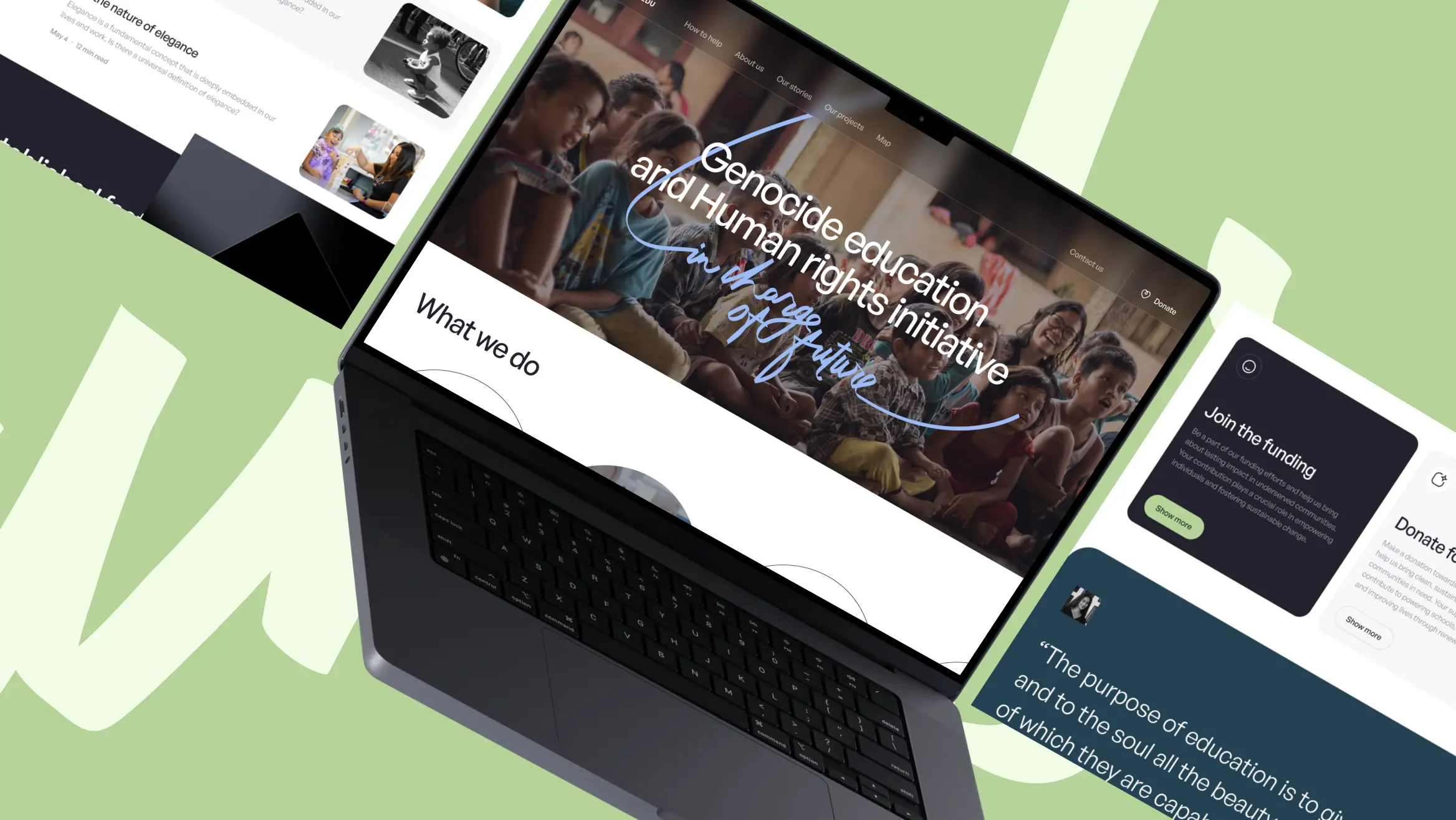
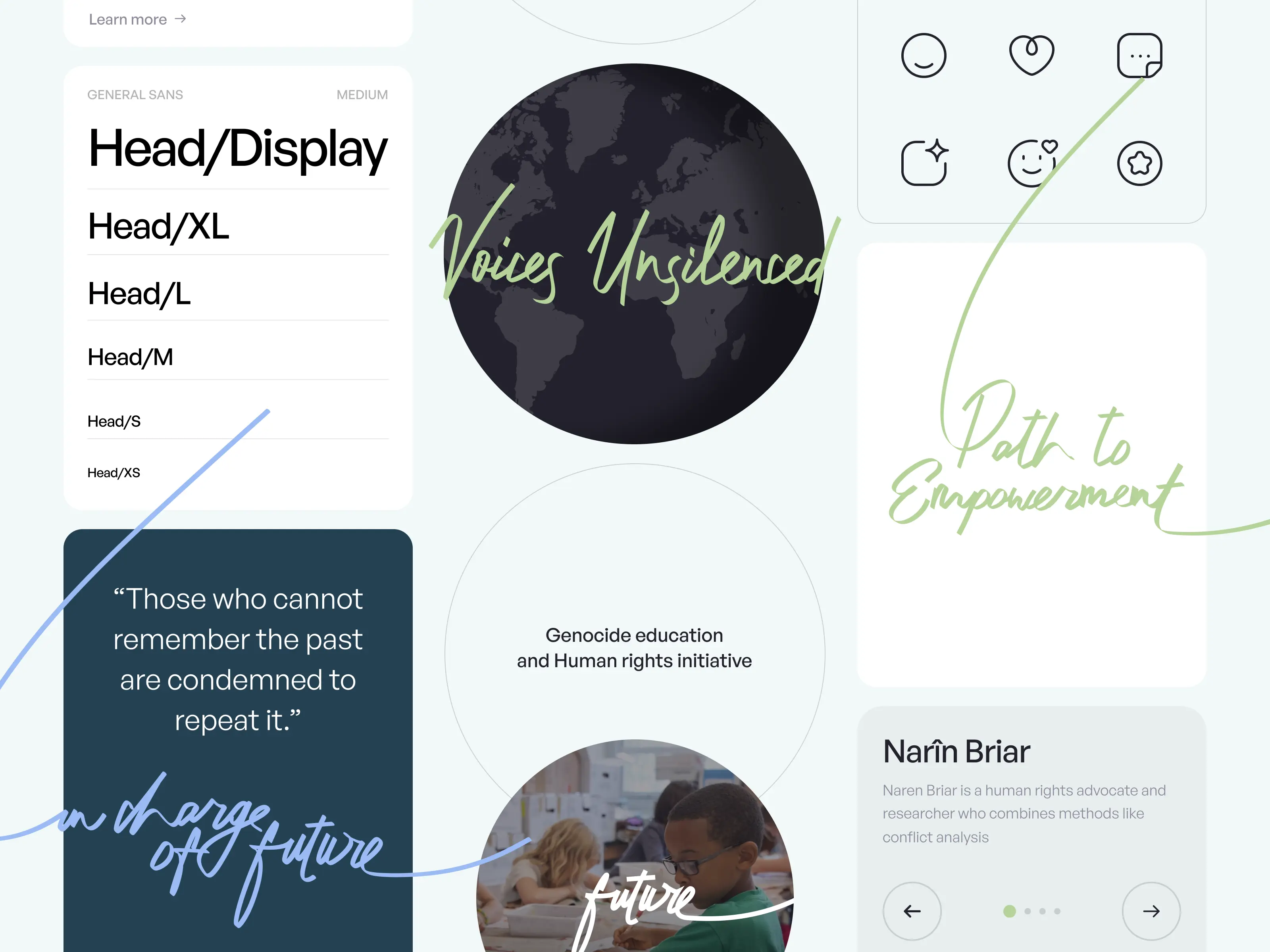
A Meaningful Homepage
The key principle when designing an NGO website is to create a clear, accessible, and engaging platform that resonates with the organization's mission.
It's important to present information in an organized manner, highlighting the NGO's goals, achievements, and ways for the audience to contribute. By doing so, you ensure that the UI/UX design aligns perfectly with the NGO's purpose and encourages visitor engagement.
Following this principle, we structured the homepage to efficiently convey the organization's message and designed a sectioned User Interface to display the NGO's values, its main purpose, significant achievements, and direct calls to action.
The homepage’s hierarchical arrangement helps introduce users to the heart of GenocideEdu's mission. Each section built a seamless user experience that guides users through the NGO's content.
We carefully blended the founder's photos, inspiring quotes, and powerful stories into the website's design, creating a balanced and engaging UX. This ensures that when someone visits the site, they can easily find all the information they need to get involved and support the NGO's important work, without feeling overwhelmed.
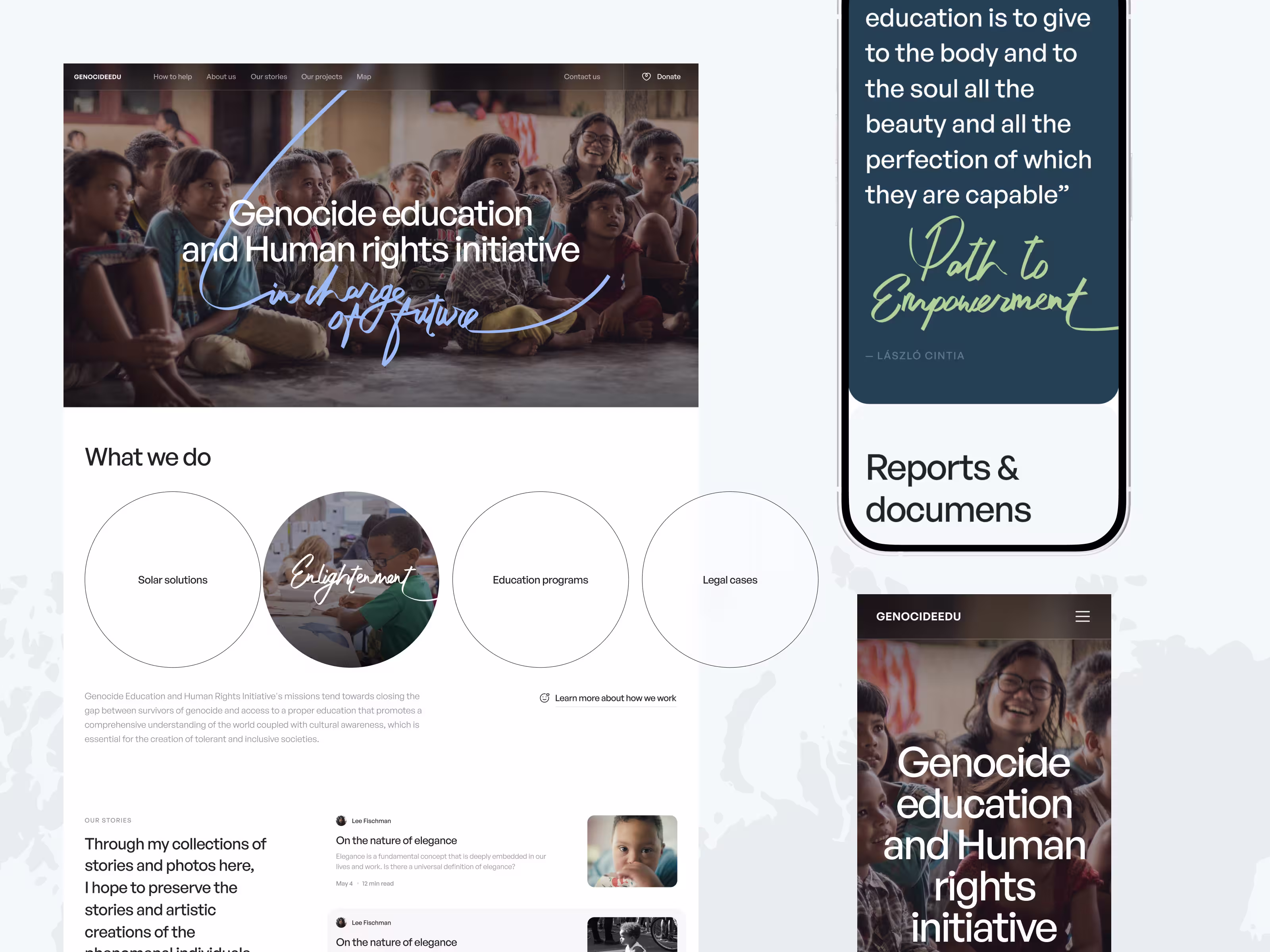
Branding That Inspires Action
Together with our client, we decided to step away from a typical corporate UI and develop an approachable, motivational style to honor the NGO’s core value—people. How did we design a website around people? Through effective emotional appeal.
Inspired by the stories gathered by the founder, our UI design combined calligraphic fonts and minimalistic graphics, symbolizing transparency and the power of storytelling.
The brand’s message and emotional appeal are also expressed using color. After thorough research into human rights and similar educational, and fundraising NGOs, our designers chose green and blue hues for this project.
Don’t be mistaken, green is not only reserved for environmental causes. The psychological effect of the color green triggers an association with growth, harmony, and freshness. It's like a breath of fresh air and gives a feeling of hope, which is perfect for a human rights NGO because it shows that things can get better. It's a color that can prompt feelings of hope and renewal, making it a fitting choice for an NGO focused on human rights.
Blue is the most popular color for websites and platforms. It is all about trust and peace, making people feel safe and relaxed. In the context of human rights, blue aligns perfectly, reinforcing the organization's commitment to justice and peace. After all, it’s not a coincidence that the logo for human rights is the silhouette of a blue hand shaped like a dove.
Together, these colors create a UI/UX design that connects with the user, boosts traffic, communicates the NGO's values, and encourages action at a subconscious level.
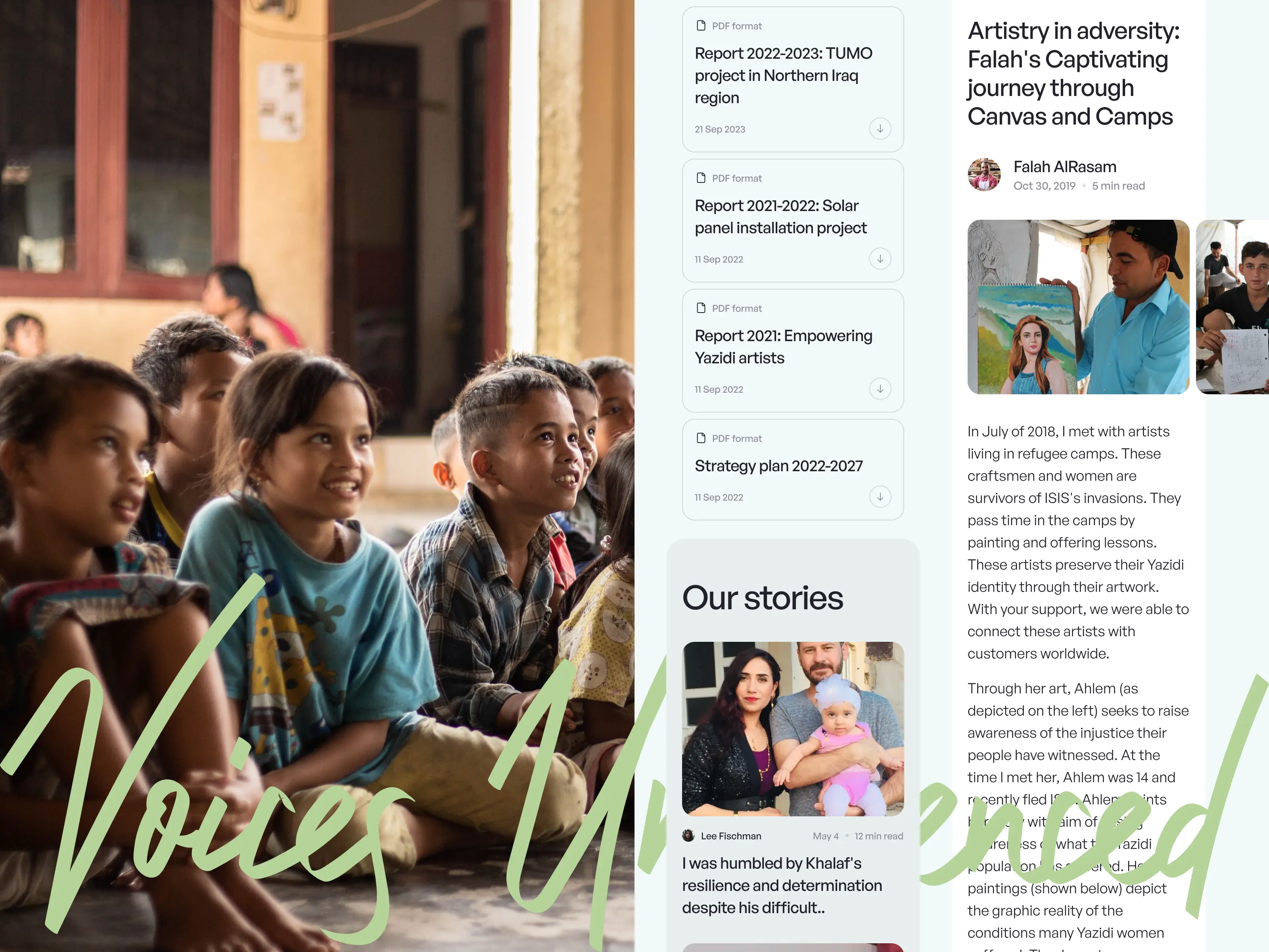
Speaking of values and people, our designers also crafted a blog design that beautifully showcases all of GenocideEdu’s inspiring stories.
A Blog Design to Engage Hearts And Minds
We focused on making every story really stand out. Narîn has been amazing at collecting and telling these stories, giving a voice to people we don't often hear from. Our main idea was to put these personal stories at the heart of the blog.
To do this, we used the photos she took, which added another layer of emotion and connectivity. Flexy designers wanted to ensure that when someone visits the blog, they feel a real link to the stories and the people in them.
We transferred the blog design and built article templates using WebFlow. It's a tool that lets you put together a website and manage content much easier than developing from scratch. Even if you're not a tech expert, it's super user-friendly, making it easy for our team and our client to keep the blog updated, change things around, and make sure every article looks great.
Navigating the Global Impact With an Interactive Map
What could be more visually stimulating in a story than a photograph? For many readers, the stories and places can sound unfamiliar, which is a feeling that distances readers from other people’s experiences, and makes it harder for them to understand the story.
As a result, viewers who do not connect to the stories are less likely to donate and join the NGO’s projects.
To bridge the gap, GenocideEdu now has an interactive map that visually links stories and people to specific places.
“A map says to you. read me carefully, follow me closely, doubt me not... I am the earth in the palm of your hand.”
Beryl Markham, English Aviator
Bringing Stories to Life With Animation
To encourage long sessions and user engagement, we used calligraphic and scroll-triggered animations.
Firstly, animations help lower bounce rates. A lively and dynamic homepage captures visitors' attention immediately, making them more likely to stay and explore beyond just the first page. It's about sparking their interest right off the bat and then guiding them through the site in a captivating way.
Secondly, these animations make the website more immersive. When visitors see something moving or changing as they scroll, it pulls them into the experience. It's like being part of a story that unfolds as they explore. This immersive quality keeps visitors on the site longer, as they get curious and click through different sections. The more time they spend engaged with the content, the greater the chance they'll connect with the NGO's mission and take action.
An immersive experience with striking animations can make the difference between a one-time visit and a lasting connection. The trick is creating short-form, light animations and videos that won’t slow the page loading speed.
Encouraging Conversion With Consistent UI Elements
Our designers stepped up for this project, creating 10+ unique icons, along with a new set of buttons, cards, and menus. The best part? All the elements, static or animated, look great on any device – phones, tablets, or computers. Plus, we've got it all covered for light or dark mode, so it's easy on the eyes no matter the user’s current settings.
Responsive design is rated as the top reason visitors might choose to end their session, which results in high bounce rates.
A design that flawlessly adjusts to different screen sizes and resolutions is a necessity and we, at Flexy, are committed to designing user-centric interfaces that minimize navigation issues and maximize engagement.
If you're impressed by our UI/UX design work for GenocideEdu and are looking for a similar transformation for your brand or business, then partnering with Flexy Global could be your next great decision.
Don't forget to check out our Behance page for a breakdown of our creative process!